Showing posts with label Links. Show all posts

Monday, May 19, 2014

MicroVisions Part 3

With the first and second MicroVisions pieces under my belt, I finally got to concentrate on the third and final painting. Like the second, I began it with some sort of idea. This idea, however, was a bit larger than the piece I would be painting. Still, I figured that this was a chance to put together a study or proof of concept.

Once again, I returned to the well of small birds. But rather than pair a small bird with a fantasy trope, I decided to set this little bird on fire. Not a horrifying, consumptive fire, mind you, but a fire emanating from within. So, kind of a miniature phoenix...but not really.

Anyway, I started with a palette of burnt sienna, raw umber, burnt umber, cadmium yellow medium, cadmium red medium, titanium white, and payne's gray. I worked the piece up to a certain point and suddenly began to question whether or not I was happy with the color scheme. It was feeling a little monochromatic. So, I took a quick photo of it, brought it into Photoshop and created two alternatives for myself. I then showed the two options to my wife for her input.


Amy chose the more colorful option, and I'm happy she did. Though the piece didn't end up nearly as saturated, I think adding the cooler colors was the right way to go.


Since being asked in February to participate in MicroVisions, my plan was always to paint multiple pieces and let the organizers decide which one they'd like. Once I'd completed this one, however, I knew full well it would be the one they chose. Still, I emailed the options and awaited their decision. Not surprisingly, this was the piece I ended up shipping out to the Society of Illustrators for the show.

The really great part about this piece is that it confirmed for me that a larger, more involved painting involving a similar subject was absolutely worthwhile. Whether it will cause me to kick to the side the large work that I seem to have stalled on has yet to be seen, but I feel like this one's got momentum and may be the next thing I set to once I've completed my current slate of commissions. Either way, it's something I'll be keeping everyone posted on. I suspect that it will be a fun and challenging painting.

That I was invited to participate in MicroVisions this year is a little mind-blowing to me. Given the caliber of artists in previous years and the quality of work produced, I honestly didn't feel worthy. But I'm very grateful to have been included, and I'm happy with the work that I got out of it.

But really, that's not the important part.

After all, this show is actually about raising money for a student scholarship fund. This piece and the others in the show are to be auctioned off and that auction went live today (May 19, 2014). Hopefully, it goes well.

If you're still interested in seeing the works in person, they are still on display at the Society of Illustrators in New York City and will remain so through May the 24th. If you're interested in seeing all of the works online, they can be found here: link. And, of course, if you're interested in bidding on the pieces, the ebay auction can be found here: link.

Thursday, May 15, 2014

MicroVisions Part 2

After completing the first piece for the MicroVisions show, I started the second and third. To change things up, I began both of these with at least a kernel of an idea. The second completed was the most heavily referenced of the three in that it ended up being based on a photo of a model I'd hired a couple times in the past.

There's really not much I can say about the process of this one, as there really wasn't much to it. I had the photo and I laid out the composition with the paint and went to town. It actually came together pretty quickly. The palette this go around was fairly limited again and was mostly alizarin crimson, pthalo green, a little payne's gray, yellow ochre, flesh tint (Windsor & Newton), Naples yellow and titanium white.

Some of you may have noticed that flesh tint was used both in this piece and the last. I'm not sure a whole lot of artists use the color regularly (if at all). That it's called "flesh tint" to begin with has always amused me as it's a pretty unnatural color to be. Were anyone's flesh actually that color, they should see a doctor immediately. Consequently, I rarely use it to paint actual skin. More often the not, it's something I mix into other colors, and is only something I use out of the tube in skies and clouds (though it finds itself elsewhere from time to time).

Weirdly, the first time I used both flesh tint and Naples yellow was after they were forced upon me by a professor during a figure painting class in college. Looking at my palette at the time and watching how I worked, he rummaged through his own supply and added them to the fairly limited range of colors I was using. Something clicked for me with both colors and they've made regular appearances on my palette ever since (though I have to admit that Naples yellow gets far more use).

All that being said, it's pretty likely that flesh tint did, in fact, find its way into the skin on this piece (though mixed down quite a bit).


Looking at this piece in the context of the range of pieces contributed to the MicroVisions show, it's fascinating that many of the contributing artists chose to paint a female face or figure. I'm not entirely sure why so many of us chose that direction. Perhaps because we assumed it might sell well and raise more money? Perhaps because it's a subject we don't often get to do? Perhaps because it's been a recurring theme in art since antiquity? I can't really speculate much on the reasons why the other artists chose to go in that direction, but I know that all three of those factors passed through my head at one point or another while painting this piece.

When I passed my options along to the organizers of the show, this piece was not the one that was chosen, and again I was okay with that. I don't dislike it, either. The real problem is that I just didn't like it as much as the one that actually made the cut.

Next week, I'll talk about the third and final piece — you know, the one that actually is in the show. Speaking of the show, as of this writing (May 15, 2014), MicroVisions is still hanging at the Society of Illustrators in New York City and will remain there through the 24th of May. Might be worth a look-see.

Tuesday, May 6, 2014

MicroVisions Part 1

Back in February, I was invited to contribute to this year's MicroVisions show. For the uninitiated, this is a show of small illustrations donated by artists to the Society of Illustrators for an auction to help bolster their Student Scholarship Fund. Given the cause, the virtual who's who of past participants and the amazing quality throughout the history of the show, I excitedly said yes, but truth be told I was nervous as all getout.

Why the nerves? Well, given the names of my fellow artists, I concluded early on that it was a foregone conclusion that I'd be bringing up the rear quality-wise. Seriously. Let's take a look at the names of the other artists, shall we?

Tran Nguyen
Nicolas Delort
Robert Hunt
Eric Fortune
Iain McCaig
Karla Ortiz
Greg Manchess

So, yeah. How am I supposed to live up to that? I couldn't. But I did have an idea.

One word: volume.

I decided that instead of doing one piece, I'd do three. The way I saw it, doing more than one relieved me of the pressure of doing that one, amazing piece that would blow everyone away while simultaneously curing world hunger, revealing all of the mysteries of the universe, and finally getting people to like me. By doing three, I could spread out such responsibility and decrease my risk of feeling like an utter failure while dramatically increasing the chances that at least one of the resulting images would be worth a damn. So I set to work.

As far as constraints go, there are virtually none with MicroVisions. There's no theme, no art direction. The pieces produced just need to be 5 inches by 7 inches. Vertical or horizontal. Given that I've of late been trying to keep some small pieces going at all times for experimentation purposes, I had a lot of spare boards laying around the studio.

The first I produced was a bit odd for me. A fairly confined value structure with a limited palette of leftover paint from a previous project. It was a pretty quick one that basically resulted from making marks on the board with paint, then wiping periodically until I saw something to build on. No preconceived notions, no photo reference. Just a bit of cloud-seeing and some crossed fingers.

Here's the piece that resulted:


It's an oddly muddy painting and is one of the most difficult pieces I've ever tried to digitally color-correct. I'm pretty sure this still doesn't do it a whole lot of justice, but the image above is as close as I've been able to get it.

If you're a curious art nerd like myself, the colors on the palette included Ultramarine Blue, Cadmium Yellow, Magenta, Flesh Tone (Windsor & Newton), and Titanium White. As it got close to completion I might have added to this list, but I don't recall whether that ended up being the case. I started the second and third pieces just before finishing this one and I did make an honest attempt at keeping the palettes separate.

Anyway, after I'd completed all three paintings, I showed them to the folks organizing the show and offered up whichever they wanted. Any reading this who've seen posts about MicroVisions on Facebook already know that this wasn't it, and I'm totally cool with that. But I'm not unhappy with the piece. It was a fun little exercise and I rather like the limited color and value.

Next week, I'll show you another piece done for the show and will follow that up with the third to coincide with the opening of the auction. As of this writing (May 6, 2014), the pieces are hanging at the Society of Illustrators in New York City and will remain so through the 24th of May. If you have a chance, go have a look.

Friday, November 22, 2013

Swamp of Theros

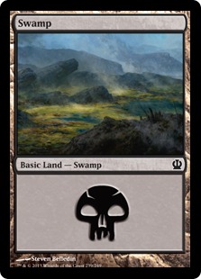
So we come to the last of our Theros lands. With the Plains, Forest, Mountains and Island covered, we at last reach the Swamp... which is the painting I'm least partial to. But that's as harsh as I'm going to be about the thing.

Looking at the five pieces, the Theros Swamp sticks out like a sore thumb. Gone are the blue sky and vivid green plant life. No golden fields to speak of, either. Just smoke and steam and all the things that live amidst the acidic boiling water of geysers and volcanic pools. With the thick plumes bellowing forth from the ground and wisps of vapor rising from the water's surface, the swamp is easily the most atmospheric of the land types. And not that subtle shift of blue-gray that comes with atmospheric perspective, either. I'm talking the thick, choking kind that obscures things that are right in front of you and makes it hard to breathe. Cool as all get out and fun to paint, for sure. But this obscuration resulted in my having to abandon an idea I had for the entire set of lands that might have made them much more of a matching set.

The big idea in question (for what it's worth) was to have hints of one of the other lands just barely visible somewhere within the composition of each painting.  For example, in the background of the plains, I wanted to clearly reference the mountain piece in the far-off mountains at right. In the mountain piece, I was hoping to include the forest piece in miniature amidst the tiny trees at the base of the rock faces. Perhaps the plains might have been visible in the far-off bits of the mainland in the background of the island piece.

You get the idea.

Now, obviously these references couldn't be explicit. I didn't want to give anyone the impression that these were dual lands — a totally different type of land that I'm not going to bother explaining, so you'll just have to trust that explicitly focusing on two types of land in one piece could be an issue. In order to keep their subtlety (not to mention because of issues of varying scale) such references would likely have been too small to read clearly in their card form. But for a 24" x 18" painting? Such a thing might have tied them together nicely. Alas, it was not to be.

What sank the idea? Well, the smoke and steam inherent to the swamp presented two problems. First, vapors that would need to be included in the swamp's composition would certainly blot out any reference I might have made to another land type in its background (the only place within the composition that I really could have feasibly put it). Second, all that atmospheric stuff shoehorned into one of the other pieces might have called too much attention to itself, thus removing the subtlety I was looking to achieve.

Still, I did spend a couple days exploring different ways of doing things. I changed the composition of the swamp around to try and accommodate the references, and I tried swapping around the references I intended to make to see if I could make different ones work. Over time, however, it became clear that I was just cramming this big idea into something that didn't need it and would likely remain unnoticed anyway. Plus, I was losing time. And so this big idea of mine ended up being dropped altogether, and (along with the temples and animals to help sell scale) it became the third thing you don't see in these paintings. Truth be told, I think the pieces are better for it.

Anyway, here is the sketch that I did in all its terribleness:

©Wizards of the Coast

Believe it or not, that got approved and so I painted it thusly:

© Wizards of the Coast

Like those before it, this piece too is oil on paper on hardboard and measures 24" wide by 18" tall.

If ever there was a piece that I've done for Magic that fully reflected my feeling at the time, this would be it. As I painted this piece, I was still feeling pretty down on my work. Not as badly as I did before, but I was hating the results of my days' efforts. And I was tired of feeling that way.

What made it worse was that I finished this piece in a barn surrounded by other painters working on their own pieces. People like Darren Bader, David Polumbo, Randy Gallegos, Greg Manchess, Dan Dos Santos, Lars Grant-West, Jordu Schell, Boris Vallejo, Julie Bell, Michael Whelan, Chris Moeller, Tony Palumbo, Scott Brundage, and Winona Nelson. If there was a hierarchy, I was bringing up the rear and I knew it. Something needed to change and I began finally to realize that I was the only person who had the power to change it.

When I finally got home, finished painting in hand, Amy and I began at last to address the malaise that we both felt. We had no idea where that discussion would lead, but we knew it needed to be somewhere other than where we were then — both mentally and physically. We decided that we wanted to leave the New York area and finally made the decision to start exploring our options. A list was formed of places we might want to move to. Number one on the list? Seattle.

This swamp was the last piece of a project that I only now realize was the beginning of a huge change in our lives. It's pretty weird and amazing where things have gone since. Where we have gone since. And it's an even weirder thing to be able to look at some of my work and still be unhappy with it, but use that unhappiness as motivation to do better on the next one.

Friday, July 27, 2012

A Stamp and A Smily Face

So a while back, I received this piece of mail:


The sender? Greg Manchess. And what's that smiley face on the right all about?


Seems to be pointing at the stamp. Why? Probably because Greg painted it.

Not every day I get mail from the person who painted the stamp affixed to it. Heck, it's not every day I get mail period — at least mail that's not junk or bills. Either way, the novelty makes this one a keeper.

In case you missed it over on the Muddy Colors blog, here's the behind scenes look at how this stamp came to be (link).

Tuesday, May 24, 2011

Link Dump!!!

A link dump?  Really?  Total cop-out, I know.  But here's the deal, I'm up to my eyeballs in trying to get work done before this weekend (where I'll be appearing at the Magic Grand Prix in Providence, RI).  I'm really close to getting my assignment done (which is due on Friday), and I'm making the final push to hammer it home today.  As such, I'm going to give a couple nice little links from other blogs to check out.

First and foremost, here's a link to an entertaining article about the laws of freelancing from my cousin Chuck Wendig's blog.  It's full of perversity, sprinkled with profanity, and chock-full of truth.  I highly recommend it:


This Is Freelancer Law, Or: "How To Not Suck As a Freelancer"

Also, as an aside, Chuck and his wife just welcomed into the world a brand new (as opposed to used) baby boy.  You can read all about it (if you're so inclined) here: link.

Second, I'm going to link to a nice little blurb that Chris Moeller did for the Muddy Colors blog.  It's a good one for folks who have recently matriculated from college and are trying their hand at illustration.  As it's from the Muddy Colors blog, most of you reading this will already have seen it, but if you haven't, it's definitely worth a look-see as it, too, is full of truth and some good advice.  If you're wondering where I stand on the matter, just read what Chris has to say because my feelings are right in line with his.

Life After Art School: Five Years to an Illustration Career

Finally, here's a nice article by Donato about the ongoing debate as to whether or not art school and all of its expense is necessary nowadays with so many less traditional (and cheaper) options are available.  I have my own feelings about this subject which I'll likely put down at some point, but for now this is a pretty good start.  Donato makes some really excellent points, and he's made an excellent summation of how his own choices affected his path.


Career Choices

Well, that's it for me today.  Back to painting and making prints.  I'll hopefully be back with something a little more substantial tomorrow.  Well, substantial on my part.  There's definitely a lot of meat to savor in the above links.

Monday, March 21, 2011

Sick Day Links

So, I've been dealing with what is either a really bad cold or a mild case of the flu.  Usually, I can handle these things and still get a fair amount of work done.  Sure, I'll be really exhausted at the end of each day, but at least I have something to show for myself.  This time is a little different.  While I'm attempting to get some painting done, I've found it rather difficult to paint with any kind of precision due to constant coughing fits.  I'm also finding it difficult to keep a train of thought long enough to put together any post that has any depth.  Things just aren't coming together for me today.  As a result, I'm throwing out a few links to tide us all over.

Fellow artist Christopher Burdett sent out a simple questionnaire to as many other illustrators as he could think of.  He asked three simple questions:

1) What was the first thing in your life that made you think, "I want to be an artist"?

2) What do you like LEAST about being an artist?

3) What do you like MOST about being an artist?

Here are links to the responses he got: Part 1, part 2, part 3. Worth checking out, I assure you.  Of course, given the cross section of folks who read this blog, chances are you have either already read it or contributed to it, yourself.

Anyway, I'm going to try and get a bit more large shape painting blocked in.  Maybe a spot of laundry.  Maybe a nap.  Who knows?!

Friday, March 18, 2011

Cheese Platter 3: New York Edition

•I have lost the ability to walk through crowds efficiently.  At the peak of my powers, I could read a crowd and wind my way through it quickly.  I'm not sure how to explain the path that I saw, but I saw it and charged ahead.  Once I was like Morpheus and now I am like so much Neo.

•I used to have good subway timing.  I was one of those people who constantly walked onto the platform just as the train arrived.  Either my timing has changed, or the MTA's has.  Either way, the effect is the same.  I now actually have time to plink away on my phone, letting time slip by while I await the coming of the next train.

•I'd like to give a shout out to someone who lives in my old building.  It's unsolicited, but I know a fair number of folks who like plants and such, so I thought this might be a good time to toss something out there.  Stephen Orr is the editorial director for gardening at "Martha Stewart Living," and has written a book called Tomorrow's Garden: Design and Inspiration for a New Age of Sustainable Gardening, which can be bought here.  He also has an excellent blog that includes a clip of his recent appearance on Martha Stewart's show.  He's a super good guy and I urge any of you into plants, flowers, and horticulture to check it out.  That blog can be found here.

•In my old neighborhood, there are fourteen pharmacies within a fifteen minute walking distance.  At least one more is planned.  There are almost as many banks.  What's crazy is that you can stand in front of one Rite Aid and see another one from where you're standing, all without having to strain your eyes.  Aside from pointing to the profitability of pharmacies, I think this fact also says quite a bit about the mean age of Jackson Heights' population, as well as it's overall level of health.

•It's strange to visit a city you once lived in for sixteen years.  Especially when you're staying at a hotel in Times Square.  I think before this past week, I'd only actually stayed overnight in Manhattan a handful of times, and only once before in a hotel.  Given the location, I expected the large numbers of tourists and in the area to be an issue.  It turned out not to be as soon as I realized I was one of them.

Thursday, March 3, 2011

10,000 Strong... And Growing

When I started this blog in August of last year, I didn't think it would be much more than a blip on anyone's radar.  It turns out I was wrong.  Well, sorta.

In the grand scheme of things, this blog doesn't really receive a whole lot of traffic.  Still, yesterday I passed 10,000 hits and this will be my 84th post.  For me, that's a lot of hits.  Considering that I'm a middling artist who is late to the blog party, and considering also just how many art blogs there are I'm pretty happy with how things have turned out.  Fact is, I didn't expect to reach this point within my first full year.  I was just hoping to get to the point where I might reach 1,000 hits per month by then.

In all reality, I have three other sites to thank for much of my blog's traffic, and I'll take this opportunity to plug them.

First is Matt Stewart's blog (link).  While I'm unsure whether or not he's ever specifically mentioned me in a post (I've been following and I really can't remember), I cannot imagine what I did to get listed among his friends.  The fact that I'm on that list has funneled quite a few folks in my direction, and I thank him.

Second is Star City Games website (link) where my FAQ entry about card alterations was mentioned in an article about collecting all things Magic.  According to said article, "Steven Belledin is strongly anti-alteration," which I guess if fair, though I would qualify that with my being against doing alterations rather than being strictly anti-alteration as a while.  Still, the article sent a lot of folks my way, and is actually a nice article in general for the collectors and the collected.  It's always good to see how folks on the other side of the table see things.  So, thanks to John Dale Beety and Start City Games for the shout out and the link.

Third is The Starkington Post (link), a website about the trading card game industry.  I assume it was Bill Stark who wrote up the article featuring links to my series on reference, as well as giving my blog and website plugs.  I really appreciate the the mention and the kind words.

Thanks to everyone who has been reading this blog, regularly, irregularly, or what have you.  The next few months will be trying at times as I'll be jostled around quite a bit by work, taxes, and some minor fixes in my old apartment.  Despite all this, I have pretty big plans as far as content.  I have a few interviews I want to conduct, and I'll be putting up process shots of a personal piece or two as they happen.  Hopefully that'll be worth everyone's time.

Cheers!

Thursday, February 24, 2011

First Born Doubt


As Greg Manchess looked at this piece at Boskone this past weekend, he admitted to me that as I painted it, he wasn't sure I would be able to pull it off.  You see, Greg saw this piece come into being at the Illustration Master Class in 2009.

Greg was probably right to worry.  It was uncharted territory for me, and glowing holograms aren't exactly a cake walk.  Add to that the fact that my initial sketches for the piece were a disaster, and you've got real concerns.

Anyway, here are my initial sketches.

Not in the face!  Actually, I kind of like the way he seems almost impaled by the holograms.  Hmmm....

This might be the worst "manipulating holograms" pose in history.  Well, my history, anyway.

The first one is a pretty simple, solemn image.  The second, a pretty awful montage-y kind of ordeal.  I can't say that either one worked as is.  While the sketches were on the wall being reviewed, I began to race through a new sketch, hoping to get it done before I was called upon.

I really didn't like either sketch overall, but I thought that the diagonals of the holographic ships in the first sketch were salvageable.  I thought it important to keep the solemnity, but I felt that you should be able to at least see the main characters hands.  Here's what I came up with:


Obviously, this sketch is what I wet with.  Much prodding went on but with the week I had at IMC, I just couldn't get it done.  So, I completed the piece at home.

I assume that Greg had seen at least the finished piece online.  But I think this past weekend was the first time he'd gotten to see it in person.  That he was worried about the overall success of the piece doesn't shock me.  Nor am I angry in his obvious lack of faith (twists the knife...).

You see, early on I learned to face difficult pieces head on.  Even if you're out of your depth, you have to try and tackle the problem.  Collect the necessary reference.  Do some research.  Build models if you have to.  Get as prepared as you can.  Then, have at it.  Shoot for the moon.  If you fail, fail spectacularly.  And remember that it's better to fail because you weren't good enough, than to fail because you didn't try.

I remember someone asking my father how he did something or other.  The lack of context doesn't help, I know.  But rest assured that whatever feat this was in reference to was noteworthy (there are many tales of my father that are).  So after being asked the hows of it all, I remember my father replying that he was able to do whatever it was that he did because he was too stupid to know he couldn't.  If I'd been on the ball during my conversation with Greg, I would have quoted my father.

After years of tackling things head on, I've stopped worrying about whether or not I can do things.  Sure, I've failed along the way.  There are pieces that no one will ever see, and pieces I wish I could take back.  But every once in a while a step forward is taken, a leap is made, a job is done well.

As a complete aside, I don't want to make it sound like Greg Manchess is some jerk.  He's a really good guy, and someone I feel lucky to have gotten to know on any level.  He's easily one of the most giving people I've ever met.  Also, it just so happens that he has an excellent post over at the Muddy Colors blog about judging shows, and specifically judging Spectrum.  Check it out.

As a completely different aside, I fully recognize that the success of the piece contained herein is fully debatable.  That fact has been made very clear to me by a few folks out there (you know who you are).  It's entirely possible that I will one day burn this piece or give it away so I don't have to look at it anymore.  But, right now, I'm still pretty happy with how it turned out.

Tuesday, November 2, 2010

Link To An Interview

Here's an interview I did for Wizards of the Coast while in Bochum (link).  It was a bit difficult to talk and sign at the same time, but I somehow managed.  Plus, Tim Willoughby (the interviewer), did a pretty good job paraphrasing when necessary in order to turn a random conversation into something a bit more clear.

I do have quite a bit to say about Bochum, but I figured this would be a good primer.  More later on what I'm told was the 5th largest Magic Grand Prix ever.

Wednesday, September 8, 2010

A Terrible Mind

So, admittedly there's been less stuff on the site of late.  I admit that I've been a little delinquent, but there's been an awful lot of work to do and a lot of juggling going on behind the scenes that may or may not lead to big news in the near future.

I've also had the misfortune of having one of the articles I was working on diligently completely rendered obsolete upon reading some stuff that my second cousin, Chuck Wendig, cooked up on giving and receiving criticism.  If you want, you're free to go dig for these articles on his blog.  Given that these blog entries are more specifically about literary criticism, they don't quite hit the nail on the head of what I was going to get at, but the articles are useful nonetheless.  I'm counting, however, on your laziness so that when I finally get a chance to revise and reconstitute my articles, I won't lose anyone with any apparent redundancies.

In the meantime, I recommend you check out these two entries that Chuck has put together regarding life as a freelancer.  Though he's once again coming at it from the point of view of a freelance writer, the issues he discusses are universal and cut to the bone.  If you're pondering the freelancer's life, these articles make a good start to any pro/con list you might put together.

First article is: Want To Be A Freelancer? Just Punch Yourself In the Face Instead 

Second article is: Why You Should Freelance (Despite All That Face-Punching Business)

Enjoy!