Landing pages often serve as the digital doormat for your small business—they’re the first thing visitors see when they engage with your brand. But more often than not, small businesses struggle to find the right balance when it comes to copy, visuals, design, trust elements, and much more.
The question is: How do you create a high-converting landing page for your small business?
Here’s the short answer. Creating a high-converting landing page is half science, half art. While there’s no strict formula you can follow, there are some best practices that can help you convert more visitors. Get the checklist for these as well.
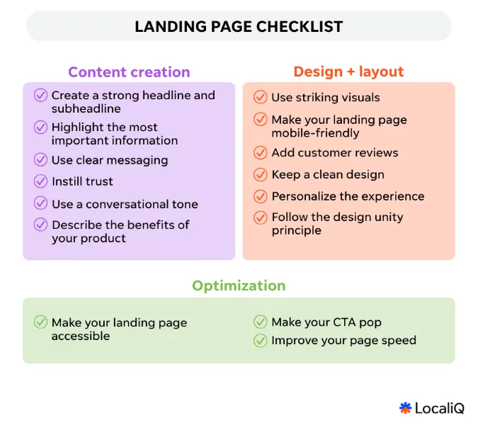
The thing is, you don’t have to go crazy. This landing page checklist of 15 fundamentals covers the copy, design, and technical details you need to create a landing page that converts more visitors into customers.
Contents
- What is a high-converting landing page?
- 15 best practices for a high-converting landing page checklist
- The fundamental landing page checklist
What is a high-converting landing page?
First things first: what qualifies as a high-converting landing page?
As reported by DigitalSilk, the average landing page conversion rate across all industries is 4.3%. While the conversion rate can vary depending on the industry, target audience, and offer, a good benchmark is a conversion rate of 2-5%.
To bring that home, a high-converting landing page is one that steadily brings in customers at an increasing rate. So, if last year you averaged turning 2% of all new website visitors into paying customers, this year it should be 3%. And the checklist of landing page best practices is how you’ll get there.

High-converting landing page checklist: 15 steps for success
There are tested and proven ways to improve your conversion rate, no matter the industry you’re in. Here are 15 best practices and real-life examples we’ll use to build our landing page checklist—and help you boost your landing page conversions.

1. Create a strong headline and subheadline
If the first thing someone reads doesn’t catch their attention, the rest of the page won’t matter. According to the father of advertising, David Ogilvy, your headline is 80% of the battle. So, it should be clear, punchy, and benefits-focused. Follow that with a subhead that backs it up, giving context in one or two sentences (here are some headline examples to get you started).
Don’t forget, the key is to keep it simple. Make sure to use numbers, questions, and power words to draw attention instantly and keep visitors engaged.
In this example from Kopari Beauty, the brand uses a short, punchy, and evocative headline. It instantly paints a picture. The headline is followed up with a subheadline that presents the main benefit—SPF 50 setting mist. That’s killer copy for a beauty product.

Kopari’s headline gets a bronze(er) medal for clear and compelling copy.
2. Highlight the most important information
While the widely cited “eight-second attention span” myth has been debunked, the reality remains: people are overwhelmed by information. In a crowded digital space, capturing attention still hinges on prioritizing what matters most. Clear, focused messaging, delivered early, makes all the difference.
In this example from AKT, the brand gets straight to the point, highlighting key benefits right away: it’s a limited-edition deodorant made with natural ingredients, and it won’t cause irritation or leave stains.

The checklist format and whitespace make AKT’s product benefits stand out.
3. Use clear messaging
Your landing page is the digital equivalent of a salesperson, so instead of using marketing jargon, make sure to convey a clear message. Your visitors should understand what you’re selling, what it does, and why they need it without doing a deep research dive on your website.
Take Promise by Eff, for example. They have a “what to expect” section where they give visitors all the information they need. Keep your copy straightforward. If your customers have to puzzle it out, you’ve already lost them.

Promise by Eff’s “what to expect” page removes any uncertainty for potential customers.
4. Instill trust
No matter how comfortable we are with online shopping, we are always on the lookout for trust signals before we make a decision to buy something or to hire a services company. So whether that’s secure badges, press mentions, or the number of satisfied customers, adding these elements to your landing page can help you instill trust.
This is especially important for companies with a subscription business model. If you expect customers to subscribe and get your products or services monthly, they have to trust you. That’s why Scentbird highlights the more than one million satisfied members of its community on its landing page.

Be like Scentbird and let site visitors know how many people use and love your product.
5. Use a conversational tone
Speak like a human. A good landing page reads like you’re explaining something to your friend over coffee. It should be playful and conversational. Don’t be afraid to sprinkle in humor, but always keep it relevant. Tone sells as much as design.
The women’s body care brand, Billie, is known for its playful tone. “The summer of smooth” is tapping into that seasonal shift when people are suddenly more aware of their body hair. It’s conversational, it’s catchy, and it’s hard to ignore.

Billie’s smooth copy sets a conversational and welcoming tone.
6. Describe the benefits of your product
Tell people exactly how your product improves their day, saves time, or solves a nagging pain. Use vivid language—“wake up with energy, crush your day,” not “contains caffeine.” Sell the transformation, not the spec sheet.
Customers are not buying exercise equipment; they are buying better strength, improved endurance, and boosted mental health. They are buying a feeling—and that’s exactly how you should describe your product. Lead with the benefits, not the features.

Peloton adds emotional triggers that motivate action to its landing pages.
7. Use striking visuals
People are visual creatures. So make sure your landing page doesn’t just tell what you sell—it needs to show it. Use clean, bold images with context—someone actually using the product and better off for it.
Peach & Lily’s rewards landing page uses visuals that feel friendly and on‑brand. Avoid stock photos. Instead, go real: real people, real use cases, real emotion. It’s proof without words. Also, always make sure to add diversity. It helps people relate to your brand, and that can boost their trust.

Smiling faces make Peach & Lily’s landing page feel more accessible.
8. Make sure your landing page is mobile-friendly
Almost 63% of global website traffic is generated through mobile devices. In other words, nearly two-thirds of customers scroll through their mobiles and land on your site.
What does this mean? Your design has to work perfectly on tiny screens. No pinching, zooming, or hunting for buttons. That means thumb-friendly touch targets, fast-loading pages, and layouts that respond smoothly no matter the device.
Here’s how men’s casualwear brand True Classic does it. Notice how the copy and buttons are stacked differently to make each version more usable.

True Classic makes sure shoppers can easily maneuver through the website on mobile or desktop.
9. Add customer reviews
Checking customer reviews is an inevitable part of the modern way of shopping for products or searching for services. The truth is: People trust other people. That’s why adding social proof on your landing page can be your secret weapon. Make sure it’s real and specific. Include names whenever possible.
This is what MeUndies did for its “matching pairs” landing page. They included a striking headline, star rating, testimonials, and people’s names, which gives the page an instant trust boost.

MeUndies leaves nothing to the imagination in its customer reviews.
⭐ Free guide! How to Get More Reviews: 8 Tips to Improve Ranking, Reputation, & Revenue
10. Keep a clean design
Whitespace isn’t wasted space. It gives your message breathing room. Minimalist design cues let your message and visuals pop. And when your page looks thoughtful and polished, people subconsciously trust you more.
Check Drunk Elephant’s retinol page. It’s elegant, simple, and has zero clutter. They stick to a cohesive color palette, use readable fonts, and clean layouts. It helps customers focus on what they are looking for without getting distracted by busy design and walls of text.

Drunk Elephant’s sober site design keeps the message clear.
11. Personalize the experience whenever possible
People love feeling like the page is made just for them. There’s a common misconception that personalization feels creepy when it’s in fact thoughtful (or at least it should be). When in doubt, ask customers what they need and promise to tailor your offering to their specific needs.
Smalls does this brilliantly by asking visitors a few quick questions to build a personalized plan based on their responses. It starts with something simple: your cat’s name. And then uses that name throughout the quiz. It feels personal, like they’re actually paying attention, which makes it hard not to finish just to see the custom recommendation at the end.

Smalls makes a big impact with its personalized experience.
12. Follow the design unity principle
Every element on your page should feel like it belongs together. Fonts, buttons, visuals. Everything should be aligned. The design unity principle is all about creating harmony in a way that all elements in a design work together to create a cohesive and unified whole.
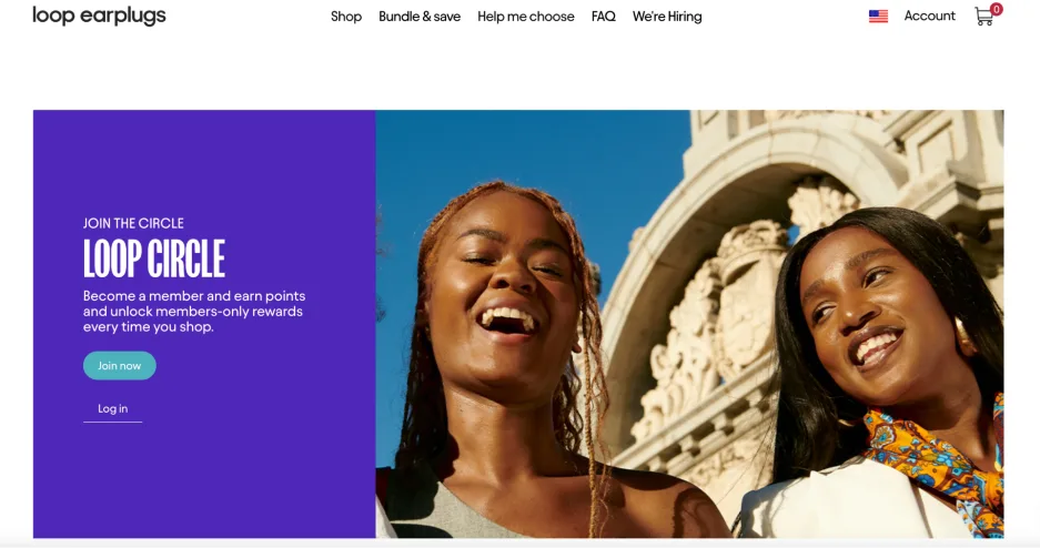
Loop earplugs uses this principle for its rewards page, by keeping button styles, form fields, and palette consistent across sections, creating a seamless user journey. Stick to a coherent visual story. It makes your page feel polished and intentional.

Loop keeps a continuity throughout its landing page design.
13. Make your landing page accessible
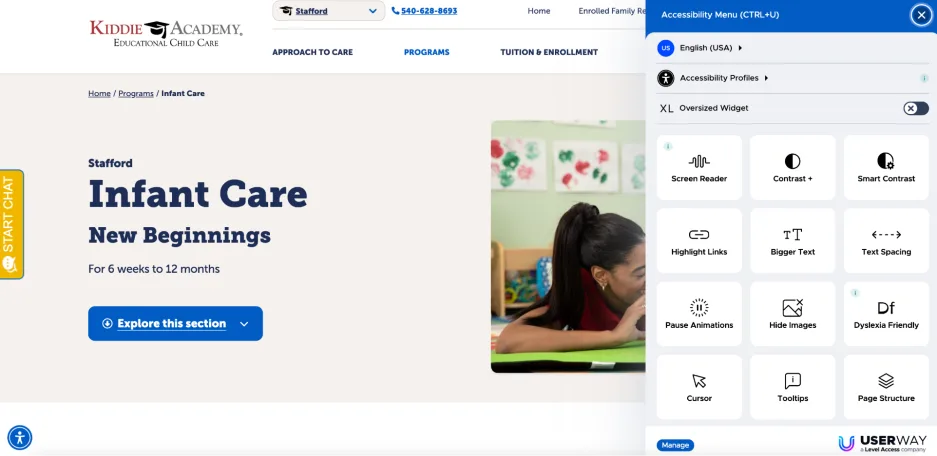
Accessibility isn’t optional. Things like alt text, readable fonts, proper contrast, and keyboard-friendly navigation have by this point become web conventions. Users now assume they’ll be able to adjust preferences like contrast, text size, spacing, and even pause animations. If your site doesn’t support that, you risk losing website visitors and potentially even customers.
Kiddie Academy’s website has an accessibility menu, allowing visitors to adjust the website to their specific needs. Good accessibility boosts UX and opens doors to a larger audience. So it’s a win-win.

Kiddie Academy’s accessibility menu makes its website accessible to more visitors, which expands its potential customer base.
14. Make your CTA pop
The call-to-action button is your portal to more sales, subscriptions, customer calls, and reservations, which is why it should be bold, visible, and compelling. Use contrast colors, action verbs, and even a sense of urgency.
The Little Gym’s CTA button stands out with a bold color and strong placement—above the fold, in the middle. If your CTA blends into the background like camouflage, all the money and effort you’ve poured into getting people to your landing page go straight down the drain. Your button needs to demand attention and invite visitors to take the next step.

The Little Gym’s bold, contrasting CTA button colors flip more website visitors into leads.
15. Improve your page speed
Slow landing pages kill conversions. DigitalSilk data shows 47% of users expect landing pages to load within 2 seconds or less. The faster your landing page loads, the smoother the experience. Less waiting means more browsing and more buying.
To speed up your page loading, start with the basics and compress your images. Then take a hard look at your scripts. If you’ve got third-party apps or trackers you aren’t even using, remove them. Also, always make sure to use tools that allow you to test on various device-browser combinations, identify bottlenecks, and optimize your landing page for different user experiences.
If you’re not sure how fast your pages load, use our Free Website Grader to find out.
The fundamental landing page checklist
We made this all easy to follow, confirm, and repeat by putting it in a checklist template you can refer to time and time again. Make a copy of our landing page checklist and go down the list so you can make sure your landing page is conversion-ready.

Refer to this landing page checklist regularly
The landing page criteria listed on this checklist aren’t only important on the day you launch your page. It’s also critical to regularly review your pages against this list to make sure edits and updates haven’t shifted them away from these fundamentals. Set a regular cadence of landing page audits and use this list to run them.
And if you’re looking for more ways to accelerate your small business growth, let’s talk.


