Tailwind CSS Max-Width
Last Updated :
23 Jul, 2025
Improve
This class accepts lots of values in tailwind CSS in which all the properties are covered in class form. It is the alternative to the CSS max-width property. This class is used to define the maximum width of an element. The value of the width cannot be greater than the value of the max-width. If the content specified within the element is bigger, max-width maintains the specified maximum width.
In this class, we will see a new, CSS property presentation, the Prose class. It has been used to have an optimal reading width. If you are familiar with the "typography plugin" then you can guess the working of this class.
Max-Width Classes
- max-w-0: This class is used to set the screen width as max-width: 0rem.
- max-w-none: This class is used to set the screen width as max-width: none.
- max-w-xs: This class is used to set the screen width as max-width: 20rem.
- max-w-sm: This class is used to set the screen width as max-width: 24rem.
- max-w-md: This class is used to set the screen width as max-width: 28rem.
- max-w-lg: This class is used to set the screen width as max-width: 32rem.
- max-w-xl: This class is used to set the screen width as max-width: 36rem.
- max-w-2xl: This class is used to set the screen width as max-width: 42rem;
- max-w-3xl: This class is used to set the screen width as max-width: 48rem.
- max-w-4xl: This class is used to set the screen width as max-width: 56rem.
- max-w-5xl: This class is used to set the screen width as max-width: 64rem.
- max-w-6xl: This class is used to set the screen width as max-width: 72rem.
- max-w-7xl: This class is used to set the screen width as max-width: 80rem.
- max-w-full: This class is used to set the screen width as max-width: 100%.
- max-w-min: This class is used to set the screen width as max-width: min-content.
- max-w-max: This class is used to set the screen width as max-width: max-content.
- max-w-prose: This class is used to set the screen width as max-width: 65ch.
- max-w-screen-sm: This class is used to set the screen width as max-width: 640px.
- max-w-screen-md: This class is used to set the screen width as max-width: 768px.
- max-w-screen-lg: This class is used to set the screen width as max-width: 1024px.
- max-w-screen-xl: This class is used to set the screen width as max-width: 1280px.
- max-w-screen-2xl: This class is used to set the screen width as max-width: 1536px.
Syntax:
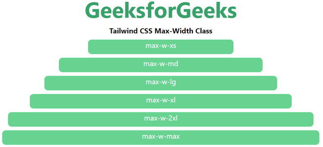
<element class="max-w-0">...</element>Example:
<!DOCTYPE html>
<html>

<head>
    <link href=
"https://unpkg.com/tailwindcss@1.9.6/dist/tailwind.min.css"
          rel="stylesheet">
</head>

<body class="text-center mx-4 space-y-2">
    <h1 class="text-green-600 text-5xl font-bold">
        GeeksforGeeks
    </h1>
    <b>Tailwind CSS Max-Width Class</b>
    <div class="h-8 max-w-xs mx-auto bg-green-400
                rounded-lg text-white">
        max-w-xs
    </div>
    <div class="h-8 max-w-md mx-auto bg-green-400
                rounded-lg text-white">
        max-w-md
    </div>
    <div class="h-8 max-w-lg mx-auto bg-green-400
                rounded-lg text-white">
        max-w-lg
    </div>
    <div class="h-8 max-w-xl mx-auto bg-green-400
                rounded-lg text-white">
        max-w-xl
    </div>
    <div class="h-8 max-w-2xl mx-auto bg-green-400
                rounded-lg text-white">
        max-w-2xl
    </div>
    <div class="h-8 max-w-max mx-auto bg-green-400
                rounded-lg text-white">
        max-w-max
    </div>
</body>

</html>
<html> <head> <link href="https://unpkg.com/tailwindcss@1.9.6/dist/tailwind.min.css" rel="stylesheet"> </head> <body class="text-center mx-4 space-y-2"> <h1 class="text-green-600 text-5xl font-bold"> GeeksforGeeks </h1> <b>Tailwind CSS Max-Width Class</b> <div class="h-8 max-w-xs mx-auto bg-green-400 rounded-lg text-white"> max-w-xs </div> <div class="h-8 max-w-md mx-auto bg-green-400 rounded-lg text-white"> max-w-md </div> <div class="h-8 max-w-lg mx-auto bg-green-400 rounded-lg text-white"> max-w-lg </div> <div class="h-8 max-w-xl mx-auto bg-green-400 rounded-lg text-white"> max-w-xl </div> <div class="h-8 max-w-2xl mx-auto bg-green-400 rounded-lg text-white"> max-w-2xl </div> <div class="h-8 max-w-max mx-auto bg-green-400 rounded-lg text-white"> max-w-max </div></body> </html>Output: