How to Create a Line Chart for Comparing Data in Excel?
Last Updated :
02 Jun, 2022
Excel is powerful data visualization and data management tool which can be used to store, analyze, and create reports on large data. It can be used to visualize data using a graph plot. In excel, we can plot different kinds of graphs like line graphs, bar graphs, etc., to visualize or analyze the trend.
Line Chart for Comparing Data in Excel
The line graph is also known as a line plot or a line chart. In this graph lines are used to connect individual data points. It displays quantitative values over a specified time interval. This graph is generally used when comparison of long term trend is needed. We can easily plot line charts in excel, follow the below steps,
For the purpose of demonstration, we will use the below given data(showing sales of a product over different years):

Step 1: Select the cell containing product data.

Step 2: Select 'Insert' Tab from the top ribbon and select the line chart.

Output

Steps to make changes in graph
Step 1: Click on chart title ('Sales in above graph)

Step 2: Chart format menu will open. Make desired changes.

For example, change the chart title and disable the legend option.

Output

You can see that the chart title is changed and legend is not there now.
Line chart from Pivot table
Suppose we have following table given below, and we want to compare the amount spend by each individual buyer:

For comparing the spent value by each individual, we have to create a pivot table.
Steps to create pivot table
Step 1: Select the data and then select pivot table from insert tab.

Step 2: Select the 'amount by buyer' option and then select existing sheet option if you want your pivot table to be present in the same sheet.

Step 3: Give the cell value where you want to place the pivot table and then select Insert.

Step 4: Pivot table will get created.

Using this pivot now, we can create line chart. To create line chart follow the steps:
Step 1: Select the pivot table

Step 2: Click on Insert tab and select Line chart option.
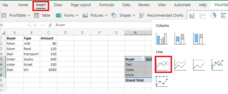
Output

From this chart we can compare the total amount spent by each individual. For example, Dad spend the maximum amount.
Similar Reads
How to Create a Bar Chart for Comparing Data in Excel? Excel is powerful data visualization and data management tool which can be used to store, analyze, and create reports on large data. It can be used to visualize data using a graph plot. In excel we can plot different kinds of graphs like line graphs, bar graphs, etc. to visualize or analyze the tren
2 min read
How to Create a Column Chart for Comparing Data in Excel? Excel is powerful data visualization and data management tool which can be used to store, analyze, and create reports on large data. It can be used to visualize and compare data using a graph plot. In excel we can plot different kinds of graphs like line graphs, bar graphs, etc. to visualize or anal
2 min read
How to Create Combination Charts for Comparing Data in Excel? Excel is powerful data visualization and data management tool which can be used to store, analyze, and create reports on large data. It can be used to visualize and compare data using a graph plot. In excel we can plot different kinds of graphs like line graphs, bar graphs, etc. to visualize or anal
2 min read
How to Create a Goal Line on a Chart in Excel? Excel is a powerful data visualization and management tool that can be used to store, analyze, and create reports on large data. Data can be visualized or compared using different kinds of plots in Excel such as line charts, bar charts, etc. A goal line is also called a target line. It helps show ac
2 min read
How to Create a Dynamic Chart Range in Excel? A Dynamic chart range is the range of a data set which automatically updates on any modifications in the original data set. It is beneficial because at some point in time we need to add or delete data from the original data set. So, we want a method to automatically update the chart on performing an
5 min read
How to Create a Step Chart in Excel A step chart is used to represent data that changes irregularly between time intervals. Now, Excel doesn't have a feature to create a Step Chart like the one shown below but we can create one by making some changes in our data. What is a Step Chart in ExcelA Step chart is the same as a Line Chart. T
4 min read
How to Create a Bar Chart in Excel? To learn how to create a Column and Bar chart in Excel, let's use a simple example of marks secured by some students in Science and Maths that we want to show in a chart format. Note that a column chart is one that presents our data in vertical columns. A bar graph is extremely similar in terms of t
4 min read
How to Create a Chart from Multiple Sheets in Excel Creating a chart from multiple sheets in Excel is a powerful way to consolidate data and visualize it in a meaningful way. Whether you're working with different datasets on separate sheets or need to compare data across multiple tabs, knowing how to create a chart from multiple sheets in Excel can s
5 min read
How to Create Dynamic Chart Titles In Excel? Excel is a tool that is generally used by accounting professionals for financial data analysis but can be used for different purposes. It can be used for data visualization, data analysis, and data management, which uses spreadsheets for managing, storing, and visualizing large volumes of data. Cell
2 min read
How to Create a Funnel Chart In Excel In the world of data visualization, funnel charts have become a go-to tool for illustrating stages in a process, especially when tracking sales or conversions. Learning how to create a funnel chart in Excel can give you a powerful way to visualize data that shows progression and drop-off through var
6 min read