React Suite Popover Follow Cursor
Last Updated :
31 Aug, 2022
React suite is a library of React components, sensible UI design, and a friendly development experience. It is supported in all major browsers. It provides pre-built components of React which can be used easily in any web application.
In this article, we’ll learn about React suite Popover Follow Cursor. The popover is used to show the popup information that is triggered on any event over the parent window. The follow cursor means that when the user hovers over a button, the Popover component will follow the cursor.
Popover Props:
- children: It is used to denote the primary content.
- classPrefix: It is used to denote the prefix of the component CSS class.
- visible: It is used to indicate whether the component is visible or not.
- title: It is used to show the popover title.
- arrow: Whether show the arrow indicator.
Whisper Props:
- container: It is used to set the rendering container.
- delay: It is used to denote the delay time.
- delayHide: It is used to denote the hidden delay time.
- delayShow: It is used to show delay time.
- onBlur: It is a function that is triggered to lose focus.
- onClick: It is a function that is triggered on the click event.
- onEnter: It is a function that is triggered before the overlay transitions in.
- onEntered: It is a function that is triggered after the overlay finishes transitioning in.
- onEntering: It is a function that is triggered as the overlay begins to transition in.
- onExit: It is a function that is triggered right before the overlay transitions out.
- onExited: It is a function that is triggered after the overlay finishes transitioning out.
- onExiting: It is a function that is triggered as the overlay begins to transition out.
- onFocus: It is a function that is triggered to get focus.
- onMouseOut: It is a function that is triggered on the mouse leave event.
- placement: It is used for the placement of the component.
- preventOverflow: It is used to prevent floating element overflow.
- speaker: It is used for the displayed component.
- trigger: It is used for triggering events.
Syntax:
<Whisper followCursor speaker={<Popover>...</Popover>}>
   <Button>...</Button>
</Whisper>
Creating React Application And Installing Module:
Step 1: Create a React application using the given command:
npm create-react-app projectname
Step 2: After creating your project, move to it using the given command:
cd projectname
Step 3: Now Install the rsuite node package using the given command:
npm install rsuite
Project Structure: Now your project structure should look like the following:

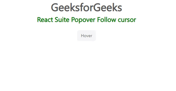
Example 1: Below example demonstrates the usage of Follow Cursor Popover.
Step to Run Application: Run the application using the following command from the root directory of the project:
npm start
JavaScript
import "rsuite/dist/rsuite.min.css";
import { Button, Popover, Whisper } from "rsuite";

export default function App() {
    return (
        <div>
            <div style={{ textAlign: "center" }}>
                <h2>GeeksforGeeks</h2>
                <h4 style={{ color: "green" }}>
                    React Suite Popover Follow cursor
                </h4>
            </div>
            <div style={{ padding: 20, textAlign: "center" }}>
                <div>
                    <Whisper
                        followCursor
                        speaker={<Popover>
                            Hovering Popover.</Popover>}
                    >
                        <Button>Hover</Button>
                    </Whisper>
                </div>
            </div>
        </div>
    );
}
Output:
Example 2: Below example demonstrates the usage of Follow Cursor popover placed at topStart position.
JavaScript
import "rsuite/dist/rsuite.min.css";
import { Button, Popover, Whisper } from "rsuite";

export default function App() {
    return (
        <div>
            <div style={{ textAlign: "center" }}>
                <h2>GeeksforGeeks</h2>
                <h4 style={{ color: "green" }}>
                    React Suite Popover Follow cursor
                </h4>
            </div>
            <div style={{ padding: 20, textAlign: "center" }}>
                <div>
                    <Whisper
                        followCursor
                        placement="topStart"
                        speaker={<Popover>
                            Hovering Popover.</Popover>}
                    >
                        <Button>Hover</Button>
                    </Whisper>
                </div>
            </div>
        </div>
    );
}
Output:

Reference: https://rsuitejs.com/components/popover/#follow-cursor
Similar Reads
React Suite Dropdown Used with Popover React Suite is a popular front-end library with a set of React components that are designed for the middle platform and back-end products. The dropdown component allows the user to provide navigation that uses a select picker if you want to select a value. The dropdown component with popover basica
3 min read
React Suite Popover Follow Cursor React suite is a library of React components, sensible UI design, and a friendly development experience. It is supported in all major browsers. It provides pre-built components of React which can be used easily in any web application. In this article, we’ll learn about React suite Popover Follow Cur
3 min read
React Suite Popover Hide Arrow Indicator React suite is a library of React components, sensible UI design, and a friendly development experience. It is supported in all major browsers. It provides pre-built components of React which can be used easily in any web application. In this article, we’ll learn about React Suite Popover Hide Arrow
3 min read
React Suite Popover Used with Dropdown React suite is a library of React components, sensible UI design, and a friendly development experience. It is supported in all major browsers. It provides pre-built components of React which can be used easily in any web application. In this article, we'll learn about React suite popover placement.
3 min read
React Suite Popover Triggering events React suite is a library of React components, sensible UI design, and a friendly development experience. It is supported in all major browsers. It provides pre-built components of React which can be used easily in any web application. In this article, we'll learn about React suite popover placement.
3 min read
React Suite Popover Container and prevent overflow React Suite is a library of React components, sensible UI design, and a friendly development experience. It is supported in all major browsers. It provides pre-built components of React which can be used easily in any web application. In this article, we'll learn about React Suite Popover Container
3 min read
React Suite Popover Placement A React suite is a library of React components, sensible UI design, and a friendly development experience. It is supported in all major browsers. It provides pre-built components of React which can be used easily in any web application. In this article, we'll learn about React suite popover placemen
4 min read
React Suite Popover <Whisper> Props React Suite is a library of React components, sensible UI design, and a friendly development experience. It is supported in all major browsers. It provides pre-built components of React which can be used easily in any web application. In this article, we'll learn about React Suite Popover Whisper Pr
4 min read
React Suite Popover Component React Suite is a popular front-end library with a set of React components that are designed for the middle platform and back-end products. Popover Component allows the user to show the popup information that is trigger on some event over the parent window. We can use the following approach in ReactJ
4 min read
React Suite Popover Props React Suite is a library of React components, sensible UI design, and a friendly development experience. It is supported in all major browsers. It provides pre-built components of React which can be used easily in any web application. In this article, we'll learn about React Suite Popover Props. The
4 min read