How to Create a Scatter Plot In Excel: Step by Step Guide
Last Updated :
19 Dec, 2024
A scatter plot in Excel is a powerful visualization tool for identifying trends, relationships, and patterns between two variables. By plotting data points on an Excel XY scatter plot, you can gain insights into correlations and outliers, making it an essential tool for data analysis. Whether you’re comparing sales and expenses, analyzing scientific data, or forecasting trends, scatter plots provide a clear picture of how two datasets interact. In this guide, we’ll walk you through the steps to create a scatter chart in Excel, including tips for switching axes and applying advanced techniques to refine your visuals.
Disclaimer: Always ensure your data is accurate and well-organized to produce reliable and insightful visualizations.
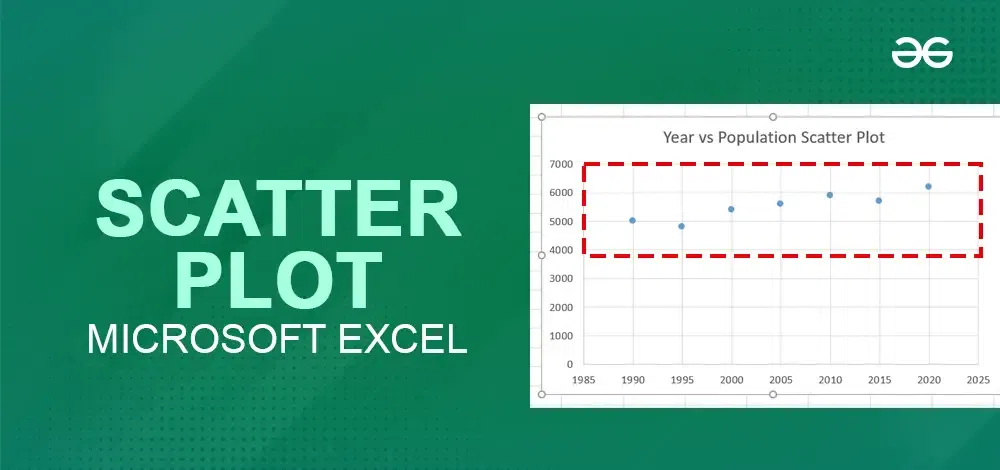 Scatter Plot In Excel
How to Make a Scatter Plot in Excel
Learning how to build a scatter plot in Excel is simple and allows you to visually analyze relationships between data points. Follow these steps to create a scatter graph in Excel and customize your scatter chart:
Step 1: Prepare Your Data
Organize your data into two columns:
- One column for the X-axis values (independent variable).
- The second column for the Y-axis values (dependent variable).
Example:
| Advertising Spend (X) | Sales Revenue (Y) |
|---|
| 500 | 2000 |
| 1000 | 4000 |
| 1500 | 5500 |
| 2000 | 7000 |
| 2500 | 8000 |
Step 2: Select the Data
- Highlight both columns of data, including the headers.
- Ensure that the data is clean, with no blank cells or text in numerical ranges.
 Select the Data
Step 3: Customize the Chart
- Go to the Insert tab on the Excel ribbon.
- In the Charts group, find the Insert Scatter (X, Y) Chart dropdown.
- Select one of the following Scatter Plot options:
Scatter Chart(standard, with just points)
Displays individual data points (dots) to show relationships or correlations between two variables.
 Basic Scatter Plot
Scatter Plot with Smooth Lines
Connects data points with smooth, curved lines to display the overall trend. It is Ideal for showing non-linear relationships or smooth transitions in data.
 Scatter Plot with Smooth Lines
Scatter Plot with Straight Lines
Connects data points with straight lines to emphasize trends or links between points. It is Used when you want to clearly show data progression or paths.
 Scatter Plot with Straight Lines
Step 4: Customizing XY scatter plot
1: Add Chart Title
- Click on the default Chart Title at the top of the chart.
- Type a meaningful title, such as "Advertising Spend vs. Sales Revenue".
 Add Chart Title
2: Add Axis Titles
- Click the chart to activate the Chart Elements button (the “+” icon).
- Check the Axis Titles box.
Rename the titles:
- Horizontal Axis: "Advertising Spend (USD)".
- Vertical Axis: "Sales Revenue (USD)".
 Click on the Small "+" Icon >> Check the "Add Titles" Checkbox >> Add Axis Titles
Right-click on any data point (dot) and select Format Data Series.
Customize the data points:
- Change the color of the dots.
- Adjust the marker style (e.g., circles, squares, or triangles).
- Increase or decrease the marker size for visibility.
 Right- Click >> Select " Format Data Series">> Go to Markers >> Change the Color
4: Add Data Labels (Optional)
To display values next to the data points:
- Right-click on a data point.
- Select Add Data Labels.
- Move or customize the labels for clarity.
 Right Click >> Select "Add Data Labels" >> Preview Results
5: Add a Trendline
If you want to visualize the overall trend in the data:
- Right-click on any data point.
- Select Add Trendline.
In the Format Trendline pane:
- Choose Linear for a straight line.
- Check Display Equation on chart to see the line equation.
- Check R-squared value to measure the correlation strength.
 Right Click>> Select "Add Trendline">> Select Linear and Check the Box "Display Equation on Chart" and " Display R-Squared Value on Chart"
6: Adjust Axis Scale
- Right-click on the X-axis or Y-axis.
- Choose Format Axis.
- Adjust the Minimum and Maximum Bounds to focus on a specific range.
 Right Click >> Select "Format Axis">> Adjust the Minimum and Maximum Bounds
Step 5: Save and Update the Scatter Plot
- Save your Excel workbook to keep your chart.
- If you update the data in the table, the Scatter Plot will automatically refresh.
How to Switch X and Y Axes in a Scatter Plot
In an Excel XY scatter plot, Excel plots the independent variable on the horizontal (X-axis) and the dependent variable on the vertical (Y-axis). If you need to swap the X and Y axes, this scatter plot tutorial makes it easy with the following steps:
Step 1: Select the Scatter Chart
Click on the chart to activate it. Small handles will appear around the chart area.
Step 2: Open the "Select Data Source" Window
Right-click on the chart and choose "Select Data" from the context menu.
 Right - Click and Click on "Select Data"
Step 3: Edit the Data Series
In the Select Data Source window, choose the series you want to swap and click Edit.
 Click on the Edit Series
Step 4: Swap the X and Y Values
- In the Edit Series dialog box:
- For Series X values, select the range that was originally for the Y values.
- For Series Y values, select the range that was originally for the X values.
- Click OK to apply changes.
 Swap the Values
Step 5: Close and Refresh
- Click OK again to close the Select Data Source window.
- Your X and Y axes will now be swapped in the scatter chart.
 Preview Results
Advanced Techniques for Scatter Plots
When working with a scatter chart in Excel, you can use advanced techniques to make your analysis more insightful and visually appealing.
1. Add Trendlines and Analyze R-Squared Values
- Add a Trendline: Insert a trendline to visualize the overall direction or pattern of data. In Excel, right-click on a data series and choose Add Trendline.
- R-Squared Value: Enable the R-squared value to measure how well the trendline fits the data. Higher values (close to 1) indicate a stronger correlation.
- Types of Trendlines: Choose between linear, polynomial, or exponential trendlines based on your dataset.
2. Combine Scatter Plots with Other Chart Types
- Overlay Line Charts: Combine scatter plots with line charts to show trends or averages alongside individual data points.
- Use Dual Axes: Add a secondary axis to compare variables with different scales.
- Layer with Bar Charts: Pair scatter plots with bar charts to provide context, such as categorical data alongside continuous variables.
These techniques enhance the depth of your scatter plot analysis and make your visualizations more impactful.
Also Read:
Conclusion
Mastering scatter plots in Excel allows you to visually explore and analyze data relationships with ease. From basic scatter plot tutorials to advanced techniques, these tools enable clearer communication of insights and data-driven decisions. By learning how to make and customize Excel charts for trends and patterns, you’re not just creating visuals—you’re crafting a deeper understanding of your data.
Similar Reads
How to Create a Pie Chart in Excel - Step by Step Guide Pie charts are an excellent way to visualize proportions and illustrate how different components contribute to a whole. Whether you're analyzing market share, budget allocation, or survey results, pie charts make complex data easily understandable at a glance. This guide will walk you through how to
6 min read
How to Create a Scatter Plot with Lines in Google Sheets: Step-by-Step Guide Google Sheets is a powerful tool for data analysis and visualization, providing various features to help you understand your data better. One of these features is the ability to create scatter plots, which can visualize the relationship between two data sets. Sometimes, you may want to add a line of
6 min read
How to Create an X-Y Scatter Plot in Excel? Excel is powerful data visualization and data management tool which can be used to store, analyze, and create reports on large data. It can be used to visualize and compare data using a graph plot. In excel we can plot different kinds of graphs like line graphs, bar graphs, etc. to visualize or anal
2 min read
How to Create Flowchart in Excel: Step-by-Step Guide A Flowchart is a valuable tool for visualizing processes, workflows, or decision-making paths, making it easier to communicate ideas and identify improvements. This article provides a clear, step-by-step guide on how to create a Flowchart in Excel, using its shapes and formatting tools to design cus
6 min read
How to Make a Bar Graph in Excel: Step by Step Guide Bar graphs are one of the most versatile tools in Excel for visualizing and comparing data. Whether you’re tracking sales, analyzing survey responses, or presenting project milestones, bar graphs offer a straightforward way to highlight key trends and differences. Learning how to create a bar graph
6 min read
How to Create a Graph in Excel: A Step-by-Step Guide for Beginners Anyone who wants to quickly make observations and represent them graphically should know how to create graphs with Excel. Whether it is the preparation of business analysis papers, academic research documents or financial reports among other things, learning how to make graphs in Excel can significa
8 min read
How to Create a Stem-and-Leaf Plot in Excel? Stem and Leaf plot is a histogram tabulation of data. Stem and leaf plot is better for data visualization and cleanliness of the data in a certified range. The plot helps determine the frequency distribution of the data. In this article, we will learn how to create a stem and leaf plot in excel. Ste
5 min read
Pivot Tables in Excel - Step by Step Guide Pivot tables are one of the important and useful Excel’s features that allows us to quickly summarize, analyze and explore large datasets whether it’s sales figures, financial reports or any complex data. A pivot table helps us to rearrange, group and calculate data easily to spot trends and pattern
5 min read
How to Create a Forest Plot in Excel? Forest plots are an excellent way to convey a multitude of information in a single picture. Forest plots have become a recognized and well-understood technique of displaying several estimates concurrently, whether used to demonstrate various outcomes in a single research or the cumulative knowledge
4 min read
How to Create Anscombe’s Quartet in Excel? Anscombe Quartet developed a situation that, despite the different datasets, with different scatter charts, data could have the same correlation values among them. Anscombe Quartet is famous to provide four data sets that tell us the importance of graphing and trend lines in the data. In this articl
4 min read