Step Circle Progress Bar in Flutter
Last Updated :
28 Apr, 2025
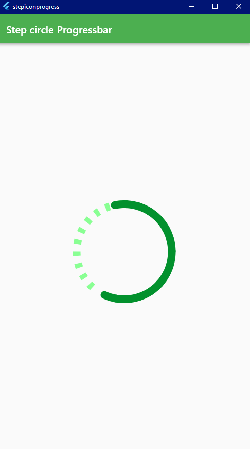
A progress bar is the circular loading bar that is seen when data or something is loading from the database, API, etc., We can also use it when we are Starting our application. A sample output given below gives you an idea of what we are implementing in this article.
Step By Step Implementation
Step 1: Create a New Project in Android Studio
To set up Flutter Development on Android Studio please refer to Android Studio Setup for Flutter Development, and then create a new project in Android Studio please refer to Creating a Simple Application in Flutter.
Step 2: Import the Package in the pubspec.yaml file
Now we need to import the package into the pubspec.yaml file, which you find at the last of the root folder. From the command line:
flutter pub add step_circle_progressbar
This will add a line like this to your package’s pubspec.yaml (and run an implicit flutter pub get):

Step 3: Import the package into the main file
import 'package:step_circle_progressbar/step_circle_progressbar.dart';
Step 4: Working with the Body of the Scaffold
Use the center widget and give it the child StepCircularProgressBar, And set the properties like size, circleSize, currentSteps, totalSteps, progressColor, stepColor.
Scaffold(
    appBar: AppBar(
        title: Text('Step circle Progressbar'),
    ),
    body: Center(
        child: StepCircleProgressbar(
            size: 200,
            circleSize: 15,
            currentSteps: 50,
            totalSteps: 10,
            progressColor: Color.fromARGB(255, 2, 145, 45),
            stepColor: Color.fromARGB(255, 137, 255, 147)),
        ),
    ),
);
Final Code:
Dart
import 'package:flutter/material.dart';
import 'package:step_circle_progressbar/step_circle_progressbar.dart';

void main() {
  runApp(RunMyApp());
}

class RunMyApp extends StatelessWidget {
  const RunMyApp({super.key});

  @override
  Widget build(BuildContext context) {
    return MaterialApp(
      debugShowCheckedModeBanner: false,
      theme: ThemeData(primarySwatch: Colors.green),
      home: Scaffold(
        appBar: AppBar(
          title: Text('Step circle Progressbar'),
        ),
        body: Center(
          child: StepCircleProgressbar(
              size: 200,
              circleSize: 15,
              currentSteps: 50,
              totalSteps: 10,
              progressColor: Color.fromARGB(255, 2, 145, 45),
              stepColor: Color.fromARGB(255, 137, 255, 147)),
        ),
      ),
    );
  }
}
Output:
Similar Reads
Flutter - Progress Border While Loading the data user needs to wait a while, During this time we can show the loading circular in Flutter Applications. Flutter is awesome as it gives you packages that make your application easy to implement, fast and pretty. While fetching the data from the database and APIs data may come af
4 min read
Flutter - Circular & Linear Progress Indicators Progress Indicator in any application displays the time which is needed for some tasks to complete such as downloading, installation, uploading, file transfer, etc. This shows the progress of a task or the time to display the length of the processes.In Flutter, progress can be displayed in two ways:
4 min read
ProgressDialog in Flutter Flutter ProgressDialog is combination of Progressbar and Alert Dialog that indicates that the application is busy. we have seen this particular widget many times in many application, like when ever we are downloading, sending request ,posting content, cancelling order, etc.Steps to Implement Progres
3 min read
Flutter - Hide the Status Bar StatusBar is located at the top of the Application, which basically shows the notification of the phones. Sample images are given below to get an idea about what we are going to do in this article.Note: If you'd prefer to customize the appearance of the status bar instead of hiding it completely, co
2 min read
Flutter - Creating App Intro Screens Flutter is known for its easiness to create cross-platform applications. Either it is creating introduction screens for the app or any screen. We got an easy way to create Intros for the app using the intro_slider library of Flutter. In this article, we are going to implement it in the sample app.
4 min read