Visualizing Text Data: Techniques and Applications
Last Updated :
23 Jun, 2024
Text data visualization refers to the graphical representation of textual information to facilitate understanding, insight, and decision-making. It transforms unstructured text data into visual formats, making it easier to discern patterns, trends, and relationships within the text. Common techniques include word clouds, bar charts, network diagrams, and heatmaps, among others.
.webp) Visualizing Text Data
Visualizing Text DataThis article delves into the concept of text data visualization, its importance, various techniques, tools, and when to use it.
Importance of Text Data Visualization
The importance of text data visualization lies in its ability to simplify complex data. Key benefits include:
- Enhanced Comprehension: Visualizations make it easier to grasp large volumes of text data quickly.
- Pattern Recognition: Helps identify trends, frequent terms, and associations that might not be apparent from raw text.
- Improved Communication: Visual representations can convey insights more effectively to stakeholders who may not be familiar with textual analysis techniques.
- Data Exploration: Facilitates exploratory data analysis, allowing users to interactively explore and understand the text data.
- Facilitates Decision-Making: By providing clear insights, text data visualization aids in informed decision-making.
When to Use Text Data Visualization?
Text data visualization is particularly useful in the following scenarios:
- Exploratory Data Analysis: When you need to explore large text datasets to identify key themes and patterns.
- Summarizing Large Text Corpora: To condense and present the essence of lengthy documents or collections of text.
- Comparative Analysis: When comparing text data across different sources, time periods, or categories.
- Communication and Reporting: To present findings from text analysis to a non-technical audience.
- Detecting Anomalies or Outliers: In contexts like social media monitoring or customer feedback analysis, where identifying unusual patterns is crucial.
Techniques for Text Data Visualization
Visualizing text data can be done using several techniques, each of which can highlight different aspects of the data. There are several types of text data visualizations, each serving different purposes:
1. Word Clouds
Word clouds are one of the most popular and straightforward text visualization techniques. Display the most frequent words in a text dataset, with the size of each word reflecting its frequency.
Use Cases:
- Summarizing large text datasets.
- Identifying key themes in customer feedback or social media posts.
Here's a simple example of text data visualization using a word cloud.
- This code uses the wordcloud library to generate a word cloud from a sample text.
- If you don't have the wordcloud and matplotlib libraries installed, you can install them using pip install wordcloud matplotlib.
Python
# Install necessary libraries if not already installed
# !pip install wordcloud matplotlib

from wordcloud import WordCloud
import matplotlib.pyplot as plt

# Sample text
text = """
Data visualization is an interdisciplinary field that deals with the graphic representation of data.
It is a particularly efficient way of communicating when the data is numerous as for example a time series.
Excel's capabilities of managing spreadsheet data through data visualization tools,
such as conditional formatting and graphing tools, have made it a widely applied data visualization tool.
"""

# Generate the word cloud
wordcloud = WordCloud(width=800, height=400, background_color='white').generate(text)

# Display the word cloud using matplotlib
plt.figure(figsize=(10, 5))
plt.imshow(wordcloud, interpolation='bilinear')
plt.axis('off')  # Remove axes
plt.show()
Output:
 Word Cloud
2. Bar Charts
Bar charts can be used to visualize the frequency of specific words or phrases in a text dataset. They provide a clear and precise comparison of word frequencies.
Use Cases:
- Comparing the frequency of keywords in different documents.
- Analyzing the distribution of topics in a dataset.
- Used to show the frequency of specific terms or categories within the text.
Code Implementation:
Python
from collections import Counter
import matplotlib.pyplot as plt

# Sample text data
text = "This is a sample text about data visualization. Data visualization is a powerful tool for exploring and understanding data. It helps us see patterns and trends that might be difficult to identify from raw numbers."

# Preprocess the text (lowercase, remove punctuation, split into words)
text = text.lower()
text = "".join([char for char in text if char.isalnum() or char == " "])
words = text.split()

# Remove stop words (optional, adjust stopwords list as needed)
stopwords = ["a", "an", "the", "is", "of", "and", "to", "in", "on", "for", "it", "with", "as", "be", "have", "at", "by", "or", "that", "my", "one", "this", "s", "what", "he", "will", "all", "from", "they", "are", "we", "her", "because", "was", "your", "when", "up", "more", "used"]
words = [word for word in words if word not in stopwords]

# Count word frequencies
word_counts = Counter(words)

# Extract top 10 most frequent words (adjust as needed)
top_10_words = word_counts.most_common(10)
word_labels = [word for word, _ in top_10_words]
word_counts = [count for _, count in top_10_words]

# Create the bar chart
plt.figure(figsize=(8, 6))  # Adjust figure size as desired
plt.bar(word_labels, word_counts)
plt.xlabel("Words")
plt.ylabel("Frequency")
plt.title("Top 10 Most Frequent Words")
plt.xticks(rotation=45, ha="right")  # Rotate x-axis labels for readability
plt.tight_layout()
plt.show()
Output:
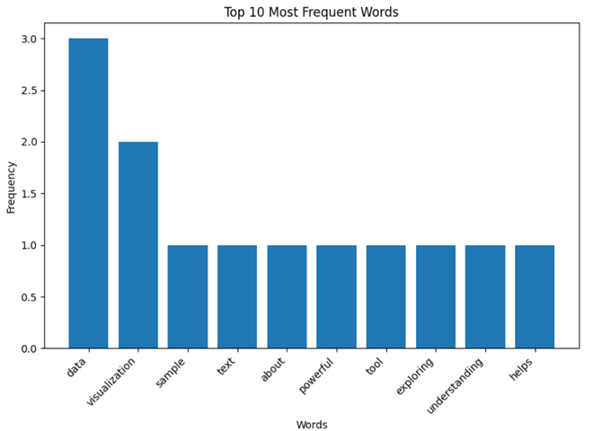 Bar Chart
3. Bigram Network
A Bigram Network is a visualization technique used to illustrate the relationships between pairs of words (bigrams) in a text dataset. This network graphically represents the most frequent pairs of words that appear consecutively in the text, with nodes representing words and edges representing the connections between them.
Use Cases:
- Understanding the contextual relationship between words in large text datasets.
- Analyzing patterns in customer feedback or social media posts to identify common themes or issues.
- Exploring text data from research articles, books, or any large corpus to discover hidden connections.
Code Implementation:
Python
import networkx as nx
from collections import Counter

# Sample text data
text = "The quick brown fox jumps over the lazy dog. This is another sentence for analysis."

# Preprocess text (lowercase, remove punctuation)
processed_text = "".join(char.lower() for char in text if char.isalnum() or char.isspace())

# Split into words and create bigrams (pairs of consecutive words)
words = processed_text.split()
bigrams = zip(words[:-1], words[1:])

# Create a dictionary to store bigram frequencies
bigram_counts = Counter(bigrams)

# Create a NetworkX graph
G = nx.Graph()

# Add nodes (words) to the graph
for word in set(words):
    G.add_node(word)

# Add edges (bigrams) to the graph with weights based on frequency
for bigram, count in bigram_counts.items():
    G.add_edge(bigram[0], bigram[1], weight=count)

# Optional: Set node sizes based on word frequency (more frequent words have larger size)
node_sizes = [bigram_counts.get((word, ), 0) for word in G.nodes()]

# Create visual output using a layout algorithm (e.g., spring layout)
pos = nx.spring_layout(G)

# Import libraries for visualization (e.g., matplotlib.pyplot)
import matplotlib.pyplot as plt

# Draw the network graph with node sizes and labels
nx.draw_networkx(G, pos, node_size=node_sizes, with_labels=True)

# Customize plot (optional)
plt.title("Bigram Network for Text Data")

# Display the plot
plt.show()
Output:
 Bigram Network
4. Word Frequency Distribution Plot:
A Word Frequency Distribution Plot is a graphical representation that shows how frequently different words appear in a text dataset. It typically displays words on the x-axis and their corresponding frequencies on the y-axis. This plot helps in understanding the distribution of words in the text, identifying the most common words, and observing the overall frequency pattern.
Use Cases:
- Analyzing the vocabulary usage in a text dataset.
- Identifying the most important words in customer feedback or social media posts.
- Comparing word frequencies across different texts or corpora.
Code Implementation:
Python
from collections import Counter
import matplotlib.pyplot as plt

# Sample text data
text = "This is a sample text to analyze word frequency distribution. It contains repeated words to showcase the concept."

# Preprocess the text (optional)
# - Convert to lowercase
text = text.lower()
# - Remove punctuation (replace with space)
text = text.replace(",", " ")
text = text.replace(".", " ")

# Split the text into words
words = text.split()

# Count word frequencies
word_counts = Counter(words)

# Extract word list and counts for plotting
word_list = list(word_counts.keys())
counts_list = list(word_counts.values())

# Create the bar chart
plt.figure(figsize=(10, 6))  # Adjust figure size as needed

# Plot the bars
plt.bar(word_list, counts_list)
plt.xticks(rotation=45, ha='right')  # Rotate x-axis labels for better readability
plt.xlabel("Words")
plt.ylabel("Frequency")
plt.title("Word Frequency Distribution")

# Display the chart
plt.tight_layout()
plt.show()
Output:
 Word Frequency Distribution Plot
5. Network Graphs
Network graphs visualize the relationships between words or entities in a text dataset. Nodes represent words or entities, and edges represent the relationships between them.
Use Cases:
- Analyzing co-occurrence of words in a text.
- Exploring relationships between entities in a document.
Install necessary Libraries:
pip install nltk
Code Implementation:
Python
import re
import matplotlib.pyplot as plt
import networkx as nx
from collections import Counter
from nltk.corpus import stopwords
from nltk.tokenize import word_tokenize
from nltk.util import bigrams
import nltk
nltk.download('punkt')
nltk.download('stopwords')

text = """
Network graphs are powerful tools for visualizing relationships between entities in a dataset.
In text analysis, they can be used to represent relationships between words, phrases, or other elements.
Use cases include visualizing connections between key concepts, exploring social networks, and analyzing patterns and clusters.
"""

# Preprocessing
text = re.sub(r'\W+', ' ', text.lower())
tokens = word_tokenize(text)
tokens = [word for word in tokens if word not in stopwords.words('english')]

# Generate bigrams
bigram_list = list(bigrams(tokens))
bigram_counts = Counter(bigram_list)

# Create the bigram network
G = nx.Graph()
for (word1, word2), freq in bigram_counts.items():
    G.add_edge(word1, word2, weight=freq)

# Draw the network
plt.figure(figsize=(14, 10))
pos = nx.spring_layout(G, k=0.5)
edges = G.edges(data=True)
weights = [edge[2]['weight'] for edge in edges]

nx.draw(G, pos, with_labels=True, node_size=3000, node_color='skyblue', edge_color='gray', width=weights, font_size=10)
plt.title('Bigram Network Graph')
plt.show()
Output:
 Network Graphs
Examples and Use Cases for Text Data Visualization
- Social Media Analysis: Visualizing the frequency of hashtags or keywords in tweets to understand trending topics.
- Customer Feedback: Using sentiment analysis visualizations to gauge customer satisfaction from reviews or survey responses.
- Academic Research: Topic modeling visualizations to summarize the main themes in a large set of academic papers.
- Market Research: Word clouds to highlight key terms in consumer opinions or competitor analysis reports.
- News Analysis: Network diagrams to show relationships between entities mentioned in news articles.
Conclusion
Text data visualization is a powerful tool for unlocking the hidden potential of textual information. By applying the right visualization techniques, you can extract valuable insights, gain deeper understanding, and effectively communicate your findings to a broader audience. As text data continues to grow in volume and importance, text data visualization will play an increasingly crucial role in extracting knowledge and making informed decisions.
Similar Reads
Techniques for Data Visualization and Reporting Data Visualization and reporting are ways to present a bunch of information provocatively, that is interactive and engaging for the viewer and the audience in mass amounts. In this article, we examine the main tools for data visualization and identify the important variables that affect the selectio
8 min read
The Art and Science of Data Visualization Data visualization is both an art and a science, blending creativity and technical skill to transform raw data into meaningful insights. It bridges the gap between complex information and human understanding, enabling us to see patterns, trends, and relationships that might otherwise remain hidden.
6 min read
Data Visualization in Infographics: Techniques and Examples Data visualization and infographics are powerful tools for communicating complex information in an easily digestible format. By combining these two techniques, you can create compelling visual stories that engage your audience and convey your message effectively. Data Visualization in InfographicsTh
5 min read
Data Visulization Techniques for Qualitative Research Data visualization techniques play a crucial role in qualitative research by helping researchers explore and communicate patterns, relationships, and insights within their data. Here are some effective techniques commonly used in qualitative research. Qualitative data, conveyed through narratives, d
8 min read
Charts and Graphs for Data Visualization As companies and groups deal with more and more data, it’s crucial to present it visually. Data is everywhere these days, and it can be overwhelming. This article is your guide to Data Visualization, which is turning all that data into pictures and charts that are easy to understand. Whether you wor
13 min read
6 Tips for Creating Effective Data Visualizations The reality of things has completely changed, making data visualization a necessary aspect when you intend to make any decision that impacts your business growth. Data is no longer for data professionals; it now serves as the center of all decisions you make on your daily operations. It's vital to e
6 min read
Text Summarization Techniques Despite its manual-to-automated evolution facilitated by AI and ML progress, Text Summarization remains complex. Text Summarization is critical in news, document organization, and web exploration, increasing data usage and bettering decision-making. It enhances the comprehension of crucial informati
6 min read
Types of Data Visualization Charts: From Basic to Advanced Data Visualization Charts is a method of presenting data in a visual way. In this guide we'll explore about the different types of data visualization charts in very detailed mannerCharts for Data VisualizationBasic Charts for Data VisualizationThese are the charts you'll face when starting with data
14 min read
Difference Between Data Visualization and Data Analytics Data Visualization: Data visualization is the graphical representation of information and data in a pictorial or graphical format(Example: charts, graphs, and maps). Data visualization tools provide an accessible way to see and understand trends, patterns in data and outliers. Data visualization too
3 min read
Data Visualization Interview Questions Step into the dynamic world of Data Visualization Interview Questions, where the power of visual storytelling meets the precision of data analysis. In today's data-driven world, the ability to effectively communicate insights through visualization is a coveted skill sought after by employers across
15+ min read