This document provides guidelines for creating effective presentations with slideshows. It presents "commandments" or rules to follow, including knowing your topic well, addressing the audience directly, keeping content simple, choosing an appropriate design template, limiting use of bright colors, using clear fonts, depicting information wisely with images and graphs, organizing content appropriately across slides, limiting animated effects, and checking equipment before presenting. The overall message is that an effective presentation focuses on engaging the audience through the presenter's delivery rather than relying solely on the slide content.
This is a minimal concept you should consider for your PowerPoint slides in order to make them more engaging and exciting.
I work as a presentation designer and help speakers and marketers with their pitches. If you need help with any of these concepts, drop me an email and I will be happy to help.
This presentation includes science-based principles on how to attract an audience's attention, sustain it, and convert a presentation into memorable content.
Great presentations mean less, not more. Make 'em simple and easy to read, and DON'T TREAT YOUR PRESENTATION AS YOUR SCRIPT.
Great presentations aren't made to be read.
21 Tips for Creating a Boring PresentationSketchBubble
Anyone can create a great presentation, but it takes a certain set of skills and determination to create a presentation that is painful to watch. Enjoy these 21 Tips to Create a Really Boring Presentation.
Stop Breaking The Basic Rules of PresentingNed Potter
Blog post at http://bit.ly/hGhaFK. Some people are confident public speakers, other people get nervous. Either way, you still see a lot of people breaking the most basic rules of presenting, and those presentations would be a lot better if they didn't.
Do you share online the same slides that you used for your live presentation? Your online audience could be missing your message. Here is an easy solution that promotes great slide creation at the same time!
8 Tips To Create Epic Visual PresentationsDeck Works
The document provides 8 tips for creating effective visual presentations: 1) Tell a compelling story to engage the audience, 2) Follow the 10/20/30 rule of no more than 10 slides, a 20 minute presentation, and 30 point font, 3) Use fewer words and headlines rather than paragraphs, 4) Use high quality images as photos convey information visually, 5) Include icons and graphs to visualize text and data, 6) Carefully choose typography as stock fonts can be boring, 7) Use complementary color palettes for good design, and 8) Structure slides with guides and master slides for consistency.
This document provides best practices for presentation design and delivery. It recommends preparing thoroughly by practicing, knowing your audience and setting. For design, it advises choosing a simple template with no more than 3 colors or font sizes per slide, and limiting bullet points and text. Visuals like charts, graphs and images should tell your story. For delivery, it suggests starting strongly, speaking clearly, making eye contact, avoiding filler words, being passionate and engaging the audience rather than reading slides. Helpful links for templates, examples and consultation are also included.
The document provides tips for creating effective PowerPoint presentations. It recommends starting with an outline on paper and focusing on the purpose and message. Use a plain background without unnecessary details. Support points with graphics like images, charts and diagrams instead of bullet lists. Consider whether a slide is needed for every part of the presentation. Create handouts with more detailed information. Pay attention to your own presentation style through posture, attire and movement. Open with something intriguing to engage the audience and ask questions to build tension. Maintain a lively speaking tone.
- Death by PowerPoint refers to boring, poorly structured presentations delivered via PowerPoint. An estimated 50% of over 30 million daily presentations are "unbearable".
- Bad presentations can lead to bad communication, less training, worse relations, and lower sales. The key to better presentations is significance, structure, simplicity, and rehearsal.
- Significance means having a clear purpose for your presentation and passion for the topic. Structure provides a logical flow. Simplicity involves clear, concise messaging using visuals over text. Rehearsal identifies issues to improve the presentation before the live event.
This document provides tips for creating effective PowerPoint presentations. It begins with an introduction of the presenter and outlines some general and corporate uses of PowerPoint. It then discusses the importance of having a clear purpose, understanding your audience, and preparing for your presentation. The bulk of the document focuses on five tips: look for quality in fonts, images and design; keep things simple with limited text and clear visuals; use visuals wisely; hold some information back rather than putting everything on slides; and prepare thoroughly instead of just winging it. Examples of good, bad and ugly PowerPoint slides are also briefly presented.
Why Presentation Matter. PowerPoint is installed on at least 1 billion computers but 95% of presentations still miss the mark. One great presentation can change the world, win hearts and minds, and convince people of your ideas.
In this SlideShare presentation, we've put together some helpful tips to improve your presentation designs and how to make your presentations more engaging.
Every presentation should understand its audience and convey your message clearly. Tell people why it matters to them, not only the what and how.
Because we truly believe presentations matter and every slide counts.
We hope you enjoy this SlideShare and if you need help with your presentation designs you know where you can find us.
This SlideShare was designed by The Presentation Designer, a presentation design agency based in the UK.
1) The document introduces Alexei Kapterev, who published a popular presentation on presentation skills 4 years ago and has since become an expert in the field.
2) While most presentations still suffer from issues like poor structure, bad slides, and boring delivery, Kapterev believes everyone can learn to present well by focusing on a few key principles rather than rules.
3) The principles of focus, contrast, and unity are described as more effective than rules, and examples are given of how to apply these principles to structure, slides, and delivery.
This document provides guidance on creating research posters. It discusses assessing the target audience and goals, developing concise content that follows a logical flow, and designing the poster for readability with visual aids and white space. Tips are provided for organizing information efficiently in PowerPoint or other software and for discussing the poster confidently. Creating an engaging summary, using graphics appropriately, and getting feedback are emphasized for effective research poster creation.
The document discusses common issues with PowerPoint presentations and provides tips for improvement. It notes that there are over 500 million PowerPoint users creating over 50 million presentations daily, with 90% being bad. Poor presentations are often due to a lack of meaning, story, simplicity, and practice. The document recommends finding meaning and purpose, telling a clear story with a beginning, middle and end, keeping slides simple with large font and minimal colors/text, and practicing presentations with feedback.
Life After Death by PowerPoint 2015 HandoutChris Shade
Tired of “death by PowerPoint”…endless slides, bullet points, and text? Alas, there is “Life After Death by PowerPoint!” And it’s not about PowerPoint, Prezi, Google Slides, or Keynote…it’s about YOU and your MESSAGE.Learn how to best connect with an audience or students based upon how the brain processes information. You will
learn how to develop brain-friendly presentations that help organize and integrate information, engage audiences or students. Walk away with the knowledge to dynamically change the way your information and material is presented.
The document provides tips for making presentations more engaging. It recommends adding pictures or photos as backgrounds, using different font sizes and colors to aid readability, limiting each slide to one main point to avoid overcrowding, and considering time spent creating slides versus standard templates. The overall message is that more creative designs can enhance presentations but may take longer to produce.
Unconventional wisdom: Putting the WHY Before the WHAT of Presentation DesignSheila B. Robinson
This is my second slide deck on presentation design and is designed to complement (and overlap a bit) my first: Data Visualization and Information Design: One Learner's Perspective. This one is in answer to the many questions I've been getting: How do you know this stuff and where did you learn it, and WHY are there all these new rules?
Enjoy!
Since I can't embed fonts on my Mac, I had to convert to pdf. Here are the links that are no longer live in the presentation:
Slide 23: http://sethgodin.typepad.com/seths_blog/2011/10/the-atomic-powerpoint-method-of-creating-a-presentation.html
Slide 71: http://www.perceptualedge.com
http://www.perceptualedge.com/files/GraphDesignIQ.html
http://www.perceptualedge.com/examples.php
Slide 72: http://www.garrreynolds.com
http://www.garrreynolds.com/preso-tips/design/
http://www.garrreynolds.com/resources/
Slide 73: http://p2i.eval.org
http://p2i.eval.org/index.php/slide-design-guidelines/
Slide 74: http://stephanieevergreen.com
http://emeryevaluation.com
http://www.storytellingwithdata.com
This document provides tips for making presentations more powerful. It emphasizes the importance of preparation such as brainstorming ideas offline before creating slides. The main message of the presentation should be distilled into a single sentence. Storytelling is recommended to engage audiences. Simplicity is key - slides should have minimal text and empty space. Overcrowding slides and reading slides verbatim should be avoided. Using colorful pictures and focusing on the presenter rather than the slides can make presentations more memorable and impactful.
Based on Alexei Kapterev's Death by PowerPoint, which inspired me a whole lot. I was so moved to redesign the pages and make them a little more interesting.
Ever wonder how the world's greatest structures are built? There are many hands that go into building them. Engineers, architects, carpenters, resulting in many professionals being contracted and no matter the scope of the project, they were completed because the carpenter had the right tools. Just like any good carpenter, presenters should carry tool belts of their own.
This document provides an overview of key features and best practices for using Microsoft PowerPoint 2010, including how to organize presentations, view and display slides, format text for readability, insert graphics and images, use shapes and SmartArt, and search the web directly from PowerPoint. The document recommends keeping presentations concise by following the "6x6 rule" of 6 words per line and 6 lines per slide, and using the "KISS principle" to keep content short and simple.
The document provides tips and guidance for improving presentation skills. It emphasizes preparing thoroughly by starting offline and focusing on curiosity before content. When designing presentations, it recommends keeping things simple with one point per slide, high quality visuals over text, and dumping templates. For delivery, it stresses practicing extensively, presenting from notes not slides, using presenter view, and asking for feedback. The overall goal is to treat audiences like kings by planning strategically and designing and delivering presentations that are visual, coherent and engage attention.
Boring to Bold: Presentation Design Ideas for Non-DesignersMichael Gowin
This document provides presentation design ideas for non-designers to make their presentations more engaging. It recommends having a clear plan and purpose, telling a story with three acts, minimizing text, using powerful images, choosing fonts and slide layouts wisely, rehearsing, and delivering with confidence. Presenters should know their audience, brainstorm their key message, and make slides beautiful yet simple while focusing on one idea per slide. Rehearsing and dressing professionally can also boost delivery, and providing handouts reinforces the content. The overall goal is to make audiences feel something rather than just informing them.
This document provides design tips for creating engaging presentations. It discusses 7 key principles: 1) having the highest signal-to-noise ratio by removing all clutter, 2) leveraging the picture superiority effect by including relevant images, 3) using empty space effectively, 4) employing contrast through differences, 5) incorporating repetition to create unity, 6) maintaining alignment so elements look planned, and 7) grouping related items through proximity. The overall message is to strive for simplicity, clarity and directness in presentations.
The document provides tips for giving good presentations by discussing presence, slide style, and design. It recommends engaging the audience through attitude, avoiding distracting mannerisms, using understandable and interesting slides, and designing slides that are readable from a distance with appropriate font size and limited text. Pictures and diagrams are suggested wherever applicable to help convey information more easily.
The document provides tips for effectively using PowerPoint for presentations. It recommends:
1) Writing a script before designing slides to ensure slides illustrate talking points.
2) Displaying one main point per slide and revealing details incrementally to keep the audience engaged.
3) Avoiding large blocks of text on slides and using notes functions to display additional details.
4) Using images sparingly and only when they provide important information or make concepts more concrete.
Presentation on how to give a good presentation (irony much?) with a focus on the tools one might choose to manage their slide content and how best to prepare those slides.
This document provides tips for using PowerPoint effectively in presentations. It discusses how PowerPoint should be used to enhance what the speaker is saying through visual aids rather than serving as the main focus or set of notes. Key recommendations include keeping slides concise with no more than 8 lines of text, rehearsing the presentation, engaging the audience visually rather than focusing on the screen, and writing a script before developing slides. The goal is to use PowerPoint to supplement an effective spoken presentation.
This document provides tips for giving good presentations and avoiding bad ones. It discusses the importance of engaging the audience, knowing the topic well, and having the right presence and attitude. It also covers best practices for slide design, such as using large readable fonts, concise bullet points instead of dense text, high contrast colors, and occasionally including diagrams or images. The goal is to effectively convey information to the audience in an interesting manner so they understand and appreciate the work.
The document provides tips for creating effective PowerPoint presentations. It recommends starting with an attention-getter, outlining the presentation, using visuals to support main points, and ending with a recap and final note. Specific design tips include using one point per slide, consistent fonts and backgrounds, and proofreading. Overall, the document stresses making slides clear, focused and audience-centered.
Microsoft PowerPoint is a presentation software developed by Microsoft that is part of the Microsoft Office suite. It runs on Windows and Mac operating systems. Presentations are created using available templates or a blank slide. Users can import various media types like audio, video, graphics and text to create engaging presentations. The slides serve to reinforce the presenter's message.
Lecture 10 using powerpoint and project presentationsMaxwell Musonda
This document provides information about using PowerPoint and other presentation software for creating and delivering presentations. It discusses PowerPoint specifically and gives tips for effective PowerPoint presentations. Some key points include:
PowerPoint is a presentation software that allows users to present information to audiences. It helps amplify messages and improve comprehension. Effective presentations use brief bullet points, simple designs, and graphics to tell their story.
The document provides 10 rules for effective PowerPoint presentations:
1. Write a script before creating slides
2. Only include one main point per slide
3. Avoid long paragraphs of text on slides
4. Pay attention to simple slide design with easy to read fonts and colors
5. Use images sparingly to reinforce points
6. Consider your presentation manner beyond just the slides
7. Open with an intriguing hook to engage the audience
8. Ask questions of the audience to encourage interaction
9. Modulate your voice to keep the presentation lively
10. Be willing to break rules when it enhances the presentation
The document provides tips for creating effective PowerPoint presentations. It recommends keeping presentations concise with sparse text on each slide. No more than 8 lines with 8-10 words per line is suggested. Graphics and charts should be limited as well, with additional details provided in handouts if needed. The presentation should tell a story with a clear beginning, middle, and end, and focus on the speaker augmenting the slides rather than relying on them.
The document provides tips for effectively using PowerPoint as a presentation tool. It discusses PowerPoint's features and 10 thoughts for using it effectively, such as using sparse slides with limited text, rehearsing the presentation, using high contrast colors, and concentrating on engaging the audience rather than the slides. It also provides other tips such as writing a script first, displaying one point per slide, avoiding paragraphs of text, paying attention to simple design, using images sparingly, thinking about the entire presentation including mannerisms, hooking the audience early, asking questions, and modulating your voice. The overall message is to use PowerPoint to enhance a presentation rather than as the presentation itself.
This document discusses effective uses of PowerPoint for instructional presentations and case studies. It notes that PowerPoint can aid learning if used carefully, but may hinder it if overused or misused. It provides examples of how PowerPoint can be used to engage students through problem-based lectures with questions, role-plays, and interactive response systems. It also describes using PowerPoint to approximate paper worksheets to illustrate processes step-by-step. The goal is to make presentations more interactive and focus on critical thinking rather than just conveying information.
This document provides tips for effective presentation skills. It discusses defining presentations and outlines key aspects of creating slides such as structure, fonts, colors, backgrounds, graphs, and conclusions. Specific dos and don'ts are covered for scientific presentations. Tips are also provided for using handouts and illustrations effectively. The overall message is that presentations should have a clear structure and focus on the key points being made through simple, easy-to-read slides.
1. PowerPoint can be an effective tool for instruction if used carefully, but may disengage students if overused or not designed well. It works best when integrating other active learning techniques.
2. Effective PowerPoint use involves engaging multiple learning styles with images and annotations, while avoiding excessive text-heavy slides or reliance only on presentation of information without feedback or student interaction.
3. Instructors should focus on active learning over passive reception of slides, using techniques like questions on slides, small group activities, and ensuring notes supplement rather than replace student notetaking to avoid disengagement.
10 Killer Tips for an Amazing Presentation - Way Before You Actually Give OneSlide Studio
This document provides 10 tips for preparing an effective presentation before actually giving it. The tips include knowing your audience and purpose, outlining your content, avoiding templates, reducing text, using simple fonts and layouts, limiting content to 1 point per slide, keeping it simple, and being aware of any presentation guidelines. It emphasizes starting preparation offline without technology, letting visuals support the presenter rather than replace them, and always having a backup plan in case of technical issues. The overall message is to focus on clearly communicating the most important messages to the audience above all other presentation elements.
PowerPoint can be a useful tool for illustrating points in a speech, but it should not replace the spoken content. When used effectively, PowerPoint enhances the speaker and speech, not overpowers it. The document provides 9 tips for using PowerPoint in a way that maintains focus on the speaker and speech, including using few words per slide, limiting animations and transitions, rehearsing without relying on slides, and focusing the audience on the speaker, not the screen.
Effective use of power point as a presentation tooljuuuuls
The document provides guidelines for effectively using PowerPoint in presentations. It recommends:
1. Using PowerPoint to illustrate content, not as an outline of the speech. Slides should have sparse text and information to avoid distracting from the speaker.
2. Rehearsing presentations thoroughly and being able to present without PowerPoint. The focus should remain on engaging the audience, not the slides.
3. Using slides sparingly and for emphasis, not as a crutch or to structure the entire presentation. Speakers should practice public speaking skills with and without visual aids.
The document provides guidelines for effectively using PowerPoint in presentations. It recommends (1) keeping slides sparse with no more than 8 lines of text per slide and 8-10 words per line, (2) using high contrast colors and simple templates, and (3) rehearsing the presentation thoroughly. It also advises (2) focusing the audience on the presenter rather than the slides and (3) using slides sparingly to enhance the presentation rather than serving as a script. The document emphasizes keeping presentations clear, organized and engaging for the audience.
Effective use of powerpoint as a presentation toolRona Obillo
This document provides guidelines for effective use of PowerPoint in presentations. It discusses key elements to consider when putting together a slideshow such as audience and purpose. It then lists 10 best practices for presenting with PowerPoint, such as minimizing text, keeping the audience's attention on the presenter rather than the slides, and rehearsing. Additional tips cover effective slideshow construction with readable text sizes, consistent templates and transitions. Overall the document emphasizes the importance of planning carefully and knowing the audience.
This document provides guidelines for effectively using PowerPoint presentations. It recommends limiting slides to the essential information, using an appropriate theme for visibility, organizing information through lists and tables, including relevant visuals like photos and charts with labels, checking for spelling and grammar errors, and focusing on clear communication rather than animation effects. The overall message is that PowerPoint should enhance a presentation by illustrating key points, not replacing a public speaking skills or overloading slides with text.
No matter how utopian your agile working environment, if you're building a commercial product, at some stage you will be asked the inevitable question - When will it be done? This talk will provide you with tools and techniques to use when you hear your manager say "We just need to get better at estimating".
If you have ever wished for a crystal ball to help you predict the team's future, this talk is for you!
This document summarizes Michele Playfair's involvement with CS in Schools, a program that teaches teachers how to teach coding to students. The summary is:
Michele saw a post about CS in Schools on LinkedIn and decided to volunteer when a spot opened up. As a former IT teacher, she was a good fit to teach coding classes for 10 weeks while the regular teacher learned. CS in Schools provides all materials and supports teaching coding using Python online. Their goal is to help more teachers learn coding so they can teach the subject, since it is now required in schools but few teachers feel qualified. The program is still piloting but aims to expand nationwide and globally over time.
This presentation was delivered at the Makati Testers Meetup hosted by Sandstone Technology on 4 August 2016.
The information in this presentation and some of the slides are taken directly from James Bach & Michael Bolton’s Rapid Software Testing (RST) class and the notes from that class (which are publicly available from satisfice.com).
This presentation is intended to provide an overview of some ideas presented in that class, I am not claiming any ownership of these ideas.
Talk delivered at Lean Agile Systems Thinking (LAST) Conference in Melbourne, 30 Jun and 1 July 2016.
Collaboration is a key component of agile development, and one of the greatest challenges to that occurs when part of your team is located off-shore. This interactive talk will discuss how to build trust, improve communication and boost the profile of off-shore testers, in order to nurture collaboration across the whole team.
This talk will be of most interest to those working with distributed and/or offshore team members. Bring along your questions, ideas, challenges and stories and let's have a conversation!
These are the slides taken from a talk I gave at Australian Testing Days 2016 (#ATD2K16).
I’ve been working on the transformation of a traditional, off-shore QA department into an involved and collaborative group of thinking testers.
There are constraints imposed by cultural differences, physical distances and the biggest challenge of all: the practices that the team was hired for, trained in, and previously rewarded for, are now the exact things you want them to stop doing.
This talk will provide some practical tips for changing testers’ hearts and minds in an offshore context.
Cucumber is a tasty and healthy snack that provides hydration and nutrients. While testing is important, the primary role of testers is not just executing tests but also improving quality. A company's culture can have a big influence on its approach to quality assurance practices.
Agentic AI - The New Era of IntelligenceMuzammil Shah
This presentation is specifically designed to introduce final-year university students to the foundational principles of Agentic Artificial Intelligence (AI). It aims to provide a clear understanding of how Agentic AI systems function, their key components, and the underlying technologies that empower them. By exploring real-world applications and emerging trends, the session will equip students with essential knowledge to engage with this rapidly evolving area of AI, preparing them for further study or professional work in the field.
Evaluation Challenges in Using Generative AI for Science & Technical ContentPaul Groth
Evaluation Challenges in Using Generative AI for Science & Technical Content.
Foundation Models show impressive results in a wide-range of tasks on scientific and legal content from information extraction to question answering and even literature synthesis. However, standard evaluation approaches (e.g. comparing to ground truth) often don't seem to work. Qualitatively the results look great but quantitive scores do not align with these observations. In this talk, I discuss the challenges we've face in our lab in evaluation. I then outline potential routes forward.
New Ways to Reduce Database Costs with ScyllaDBScyllaDB
How ScyllaDB’s latest capabilities can reduce your infrastructure costs
ScyllaDB has been obsessed with price-performance from day 1. Our core database is architected with low-level engineering optimizations that squeeze every ounce of power from the underlying infrastructure. And we just completed a multi-year effort to introduce a set of new capabilities for additional savings.
Join this webinar to learn about these new capabilities: the underlying challenges we wanted to address, the workloads that will benefit most from each, and how to get started. We’ll cover ways to:
- Avoid overprovisioning with “just-in-time” scaling
- Safely operate at up to ~90% storage utilization
- Cut network costs with new compression strategies and file-based streaming
We’ll also highlight a “hidden gem” capability that lets you safely balance multiple workloads in a single cluster. To conclude, we will share the efficiency-focused capabilities on our short-term and long-term roadmaps.
Securiport is a border security systems provider with a progressive team approach to its task. The company acknowledges the importance of specialized skills in creating the latest in innovative security tech. The company has offices throughout the world to serve clients, and its employees speak more than twenty languages at the Washington D.C. headquarters alone.
ELNL2025 - Unlocking the Power of Sensitivity Labels - A Comprehensive Guide....Jasper Oosterveld
Sensitivity labels, powered by Microsoft Purview Information Protection, serve as the foundation for classifying and protecting your sensitive data within Microsoft 365. Their importance extends beyond classification and play a crucial role in enforcing governance policies across your Microsoft 365 environment. Join me, a Data Security Consultant and Microsoft MVP, as I share practical tips and tricks to get the full potential of sensitivity labels. I discuss sensitive information types, automatic labeling, and seamless integration with Data Loss Prevention, Teams Premium, and Microsoft 365 Copilot.
nnual (33 years) study of the Israeli Enterprise / public IT market. Covering sections on Israeli Economy, IT trends 2026-28, several surveys (AI, CDOs, OCIO, CTO, staffing cyber, operations and infra) plus rankings of 760 vendors on 160 markets (market sizes and trends) and comparison of products according to support and market penetration.
Dev Dives: System-to-system integration with UiPath API WorkflowsUiPathCommunity
Join the next Dev Dives webinar on May 29 for a first contact with UiPath API Workflows, a powerful tool purpose-fit for API integration and data manipulation!
This session will guide you through the technical aspects of automating communication between applications, systems and data sources using API workflows.
📕 We'll delve into:
- How this feature delivers API integration as a first-party concept of the UiPath Platform.
- How to design, implement, and debug API workflows to integrate with your existing systems seamlessly and securely.
- How to optimize your API integrations with runtime built for speed and scalability.
This session is ideal for developers looking to solve API integration use cases with the power of the UiPath Platform.
👨🏫 Speakers:
Gunter De Souter, Sr. Director, Product Manager @UiPath
Ramsay Grove, Product Manager @UiPath
This session streamed live on May 29, 2025, 16:00 CET.
Check out all our upcoming UiPath Dev Dives sessions:
👉 https://community.uipath.com/dev-dives-automation-developer-2025/
Adtran’s SDG 9000 Series brings high-performance, cloud-managed Wi-Fi 7 to homes, businesses and public spaces. Built on a unified SmartOS platform, the portfolio includes outdoor access points, ceiling-mount APs and a 10G PoE router. Intellifi and Mosaic One simplify deployment, deliver AI-driven insights and unlock powerful new revenue streams for service providers.
Jeremy Millul - A Talented Software DeveloperJeremy Millul
Jeremy Millul is a talented software developer based in NYC, known for leading impactful projects such as a Community Engagement Platform and a Hiking Trail Finder. Using React, MongoDB, and geolocation tools, Jeremy delivers intuitive applications that foster engagement and usability. A graduate of NYU’s Computer Science program, he brings creativity and technical expertise to every project, ensuring seamless user experiences and meaningful results in software development.
6th Power Grid Model Meetup
Join the Power Grid Model community for an exciting day of sharing experiences, learning from each other, planning, and collaborating.
This hybrid in-person/online event will include a full day agenda, with the opportunity to socialize afterwards for in-person attendees.
If you have a hackathon proposal, tell us when you register!
About Power Grid Model
The global energy transition is placing new and unprecedented demands on Distribution System Operators (DSOs). Alongside upgrades to grid capacity, processes such as digitization, capacity optimization, and congestion management are becoming vital for delivering reliable services.
Power Grid Model is an open source project from Linux Foundation Energy and provides a calculation engine that is increasingly essential for DSOs. It offers a standards-based foundation enabling real-time power systems analysis, simulations of electrical power grids, and sophisticated what-if analysis. In addition, it enables in-depth studies and analysis of the electrical power grid’s behavior and performance. This comprehensive model incorporates essential factors such as power generation capacity, electrical losses, voltage levels, power flows, and system stability.
Power Grid Model is currently being applied in a wide variety of use cases, including grid planning, expansion, reliability, and congestion studies. It can also help in analyzing the impact of renewable energy integration, assessing the effects of disturbances or faults, and developing strategies for grid control and optimization.
Cyber Security Legal Framework in Nepal.pptxGhimire B.R.
The presentation is about the review of existing legal framework on Cyber Security in Nepal. The strength and weakness highlights of the major acts and policies so far. Further it highlights the needs of data protection act .
Neural representations have shown the potential to accelerate ray casting in a conventional ray-tracing-based rendering pipeline. We introduce a novel approach called Locally-Subdivided Neural Intersection Function (LSNIF) that replaces bottom-level BVHs used as traditional geometric representations with a neural network. Our method introduces a sparse hash grid encoding scheme incorporating geometry voxelization, a scene-agnostic training data collection, and a tailored loss function. It enables the network to output not only visibility but also hit-point information and material indices. LSNIF can be trained offline for a single object, allowing us to use LSNIF as a replacement for its corresponding BVH. With these designs, the network can handle hit-point queries from any arbitrary viewpoint, supporting all types of rays in the rendering pipeline. We demonstrate that LSNIF can render a variety of scenes, including real-world scenes designed for other path tracers, while achieving a memory footprint reduction of up to 106.2x compared to a compressed BVH.
https://arxiv.org/abs/2504.21627
Introduction and Background:
Study Overview and Methodology: The study analyzes the IT market in Israel, covering over 160 markets and 760 companies/products/services. It includes vendor rankings, IT budgets, and trends from 2025-2029. Vendors participate in detailed briefings and surveys.
Vendor Listings: The presentation lists numerous vendors across various pages, detailing their names and services. These vendors are ranked based on their participation and market presence.
Market Insights and Trends: Key insights include IT market forecasts, economic factors affecting IT budgets, and the impact of AI on enterprise IT. The study highlights the importance of AI integration and the concept of creative destruction.
Agentic AI and Future Predictions: Agentic AI is expected to transform human-agent collaboration, with AI systems understanding context and orchestrating complex processes. Future predictions include AI's role in shopping and enterprise IT.
UiPath Community Zurich: Release Management and Build PipelinesUiPathCommunity
Ensuring robust, reliable, and repeatable delivery processes is more critical than ever - it's a success factor for your automations and for automation programmes as a whole. In this session, we’ll dive into modern best practices for release management and explore how tools like the UiPathCLI can streamline your CI/CD pipelines. Whether you’re just starting with automation or scaling enterprise-grade deployments, our event promises to deliver helpful insights to you. This topic is relevant for both on-premise and cloud users - as well as for automation developers and software testers alike.
📕 Agenda:
- Best Practices for Release Management
- What it is and why it matters
- UiPath Build Pipelines Deep Dive
- Exploring CI/CD workflows, the UiPathCLI and showcasing scenarios for both on-premise and cloud
- Discussion, Q&A
👨🏫 Speakers
Roman Tobler, CEO@ Routinuum
Johans Brink, CTO@ MvR Digital Workforce
We look forward to bringing best practices and showcasing build pipelines to you - and to having interesting discussions on this important topic!
If you have any questions or inputs prior to the event, don't hesitate to reach out to us.
This event streamed live on May 27, 16:00 pm CET.
Check out all our upcoming UiPath Community sessions at:
👉 https://community.uipath.com/events/
Join UiPath Community Zurich chapter:
👉 https://community.uipath.com/zurich/
Let’s Get Slack Certified! 🚀- Slack CommunitySanjeetMishra29
Death by Powerpoint
1. In this presentation I am going to show you 5 issues that I have seen with PowerPoint
slides and how you can fix them
1
2. It is a universal truth that almost any presentation has too many slides, with too
much on them.
It’s not a projected essay!
So why is this a problem? Well apart from not being able to see all the words on the
screen, there’s a limited number of things we can remember at once.
2
3. In the 1950’s George Miller proposed the idea that our working memory can process
7 plus or minus two “chunks” of information at a time - where a chunk can be for
example a digit, a word, a face, a chess piece location…
If you present your information in smaller CHUNKS it can be more easily
remembered.
3
4. For a presentation the simplest way to do this is to present one idea per slide and not
overload with too many slides!
If in doubt, throw it out.
OK – Not so much text, got it – I know the way around this problem….
4
11. (pause)
At multiple conferences I have even seen people use the laser pointer to follow along
with the words as they read….
Please! No! This will send your audience off to sleep.
OK so don’t read what’s on the screen, got it, I will say something else instead! -
But….
11
12. If you have a screen full of either text or bullet points and you are talking at the same
time – whether they want to or not, your audience has to make a choice.
Will they read your slides, or listen to you speak? It’s impossible for most humans to
pay attention to both at the same time.
If there is something you really want them to read, you have to STOP talking and give
them time to read it.
And, if you want them to listen to what you are saying, don’t give them a whole
bunch of stuff to read!
12
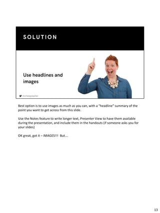
13. Best option is to use images as much as you can, with a “headline” summary of the
point you want to get across from this slide.
Use the Notes feature to write longer text, Presenter View to have them available
during the presentation, and include them in the handouts (if someone asks you for
your slides)
OK great, got it – IMAGES!!! But….
13
14. Um, not like this.
Unless the point here is that “Agile is complicated and much like a transportation
network” I don’t think this is a good candidate for a slide.
I could do a whole talk on problematic infographics and misleading graphs – but
we’ve probably seen enough of those during these COVID times that you already can
think of a few.
14
15. Here’s an example from an online conference I was at just a few days ago. WHAT IS
THAT DIAGRAM?
15
16. by Khalay Chio from the Noun Project
A diagram, graph or infographic needs to be simple, readable and support whatever
point you’re making.
Even a photo needs to be relevant or it will just be distracting
16
17. See what I mean? LOOK A QUOKKA oh wait what’s she talking about??
17
18. Now here’s one that I struggle with a bit as you may have noticed – I am NOT a
designer
Slides shouldn’t hurt your eyes. Unless like Cat Swetel, you make ugly slides like this
one on purpose so that they will be memorable.
(It worked, this is from 2018 and I remembered that I had a photo of this ugly slide).
18
19. Here’s some ideas – don’t have to be stuck in PowerPoint or Slides, you can use a tool
like Canva (which I used for this – don’t blame Canva if you hate my slides though)
Have a crack at hand drawing your slides – I am sure Rebecca’s talk earlier today gave
y’all some ideas. This pic is Katrina Clokie presenting a few years ago, this was the
first time I had seen hand drawn slides!
Or, seek help – one of my consultant friends uses a designer (“two red dogs”) for all
of his slides – maybe you’ve got a friend who’ll work for coffee or something?
So you have decided on a tool, you’re ready to get right in and do the slides…
19
20. Don’t just start cracking away in the tool. Begin with the STORY not with the SLIDES.
No matter what you’re presenting on, there’s always a STORY. This is how
presentations are made to be engaging.
You need to set out your ideas in a way that the audience will find them memorable.
20
21. Think of your presentation design as a movie storyboard which has both plot lines
and pictures.
Make sure the audience has a “what’s in it for me” – So an outline of this
presentation might look like:
You’re at the beginning of your speaking journey
You want to be a speaker that people enjoy listening to
Your challenge is to keep the audience engaged during your talks
How can this be achieved?
21
22. Glad you asked! Here’s the TL;DR summary that I am really tempted to read out
because it looks like a list!!
If we were at an in-person conference this would be the slide I hope people would
take a photo of as their main takeaway, which is why it is here in this format despite
all my other advice.
AND my last thought is….
22
23. There is no law that says you have to have a slide deck! Check out these awesome
speakers.
Jeff Patton, draws while he’s talking and has a special projector setup to show you
what he’s drawing
Angie Jones is live coding in one of her talks
Lynne Cazaly doing an online talk where she draws and uses props instead of slides,
have to say if you can do this well it’s much more engaging online.
That’s all I have - GO FORTH AND BE AWESOME!
23