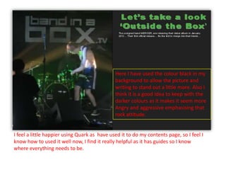
Download to read offline


This document summarizes the process of designing a double page spread (DPS) for a magazine article about a band. The designer chose green and black colors to match the mood of a concert photo and emphasize the band's rock attitude. Feedback suggested reducing the number of colors, so the designer settled on yellow, red, and white which linked to the front cover and represented energy, attention, and loyalty to music. The final DPS replaced a blurry band photo with a collage of cards and photos to create a new fitting image.


