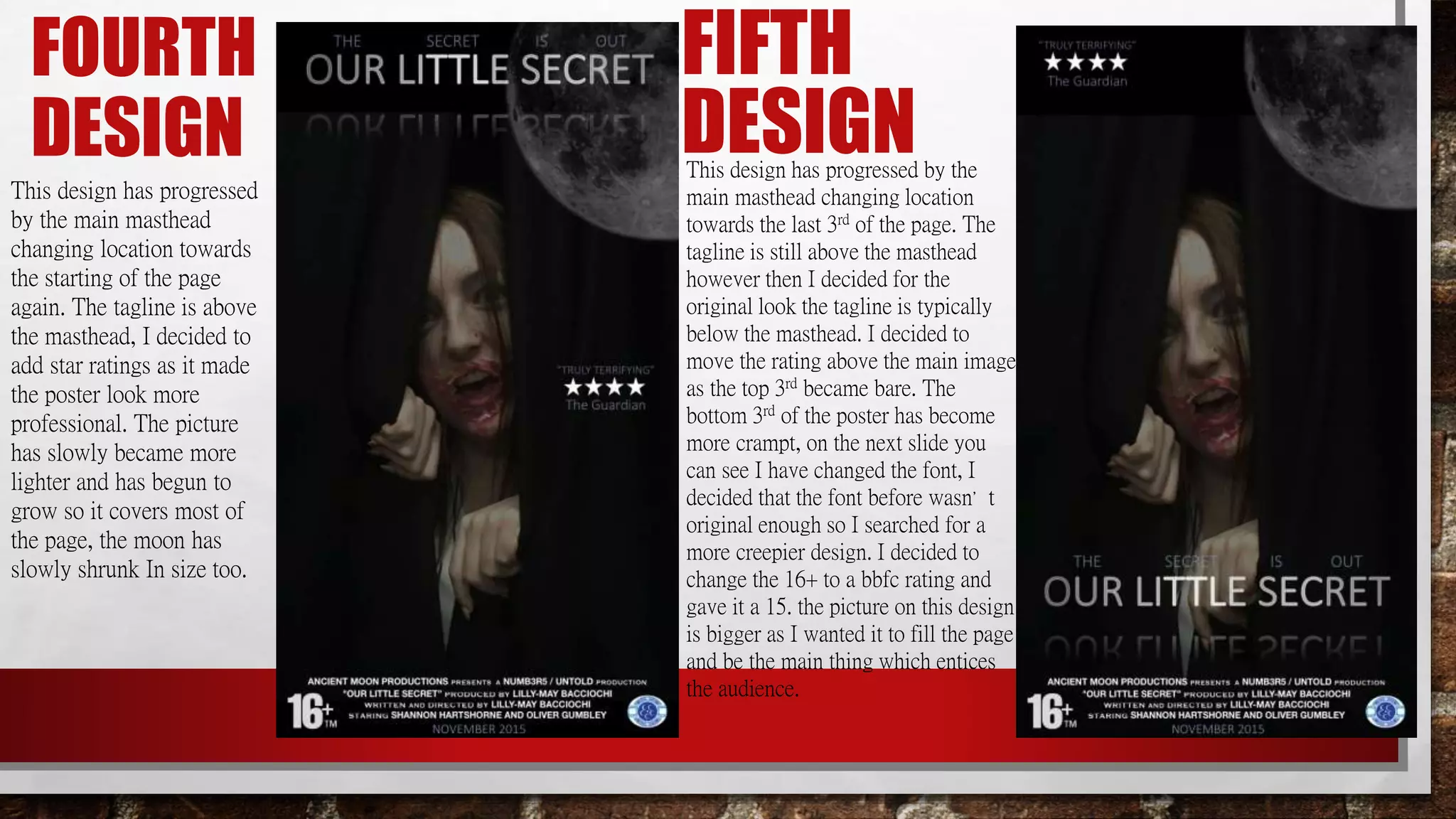
FIRST DESIGN
We decided to choose this as our design at first as we thought this fitted our idea of having Mary
as the main image but we decided to have as little writing as possible. I thought this didn’t fit the
conventions of a film poster so then I thought that id change the poster and add more text bit by
bit as you can tell by this PowerPoint of the poster progression. This was a good idea this poster
but I thought the main image should be much lighter when creating the final design and this is
why on the final design the picture is more enhanced and you are able to make out the character
even though its not as bright and in your face it is still noticeable and fits In with the creepiness of
the poster. I thought if the main image was any brighter than it would have ruined the feel of
horror poster and it would reveal the curtains in the background instead of making it seem like the
character is coming out of a crack. I could add a crack so it defines her coming out of something
but them I think it would make the poster look unrealistic and might loose the audience. I decided
to have a mirror affect on the films masthead as it is like a reflection from the moon and this is
why there is a moon in the background behind the main image.
THIRD
DESIGNThis design has progressed
by the main masthead
changing location towards
the last 3rd of the page. The
tagline is above the
masthead as I thought it
looked professional. I
decided to add in the actors
names above the main
image however I thought
why add the actors names
when the credits have been
added so on the next design
I decided to remove them.
SECOND
DESIGNThis design has progressed by the
main masthead, the font has changed
and the writing has became more
transparent. The main image is the
same as design number one, by
which I mean is still transparent, and
still only covering 2/3rds of the page.
The moon is bigger than the final
design too as on the final design the
picture has enlarged and has became
brighter. On this design I added in
the tagline, the age rating and the
production logo. Credits have been
added to include the names so the
audience knows who was involved.
FOURTH
DESIGN
This design has progressed
by the main masthead
changing location towards
the starting of the page
again. The tagline is above
the masthead, I decided to
add star ratings as it made
the poster look more
professional. The picture
has slowly became more
lighter and has begun to
grow so it covers most of
the page, the moon has
slowly shrunk In size too.
FIFTH
DESIGNThis design has progressed by the
main masthead changing location
towards the last 3rd of the page. The
tagline is still above the masthead
however then I decided for the
original look the tagline is typically
below the masthead. I decided to
move the rating above the main image
as the top 3rd became bare. The
bottom 3rd of the poster has become
more crampt, on the next slide you
can see I have changed the font, I
decided that the font before wasn’t
original enough so I searched for a
more creepier design. I decided to
change the 16+ to a bbfc rating and
gave it a 15. the picture on this design
is bigger as I wanted it to fill the page
and be the main thing which entices
the audience.
FINAL DESIGNWe decided to go with this as the final design as we thought this fitted our idea overall. On this design I added a 4 star
rating by The Guardian as it was important information for the audience. I decided that film posters need dates on so the
audience knows when the film is out in the cinemas so we added November 2015 this ensures the audience knows when to
see our film. As a pair we decided to put the month of the release date on instead of the specific date as the film is still in
production. We have also decided to add the age rating which we decided on at the beginning of starting A2 so we could
stick to continuity, as you can see the age rating is displayed as 16+. We decided to add the credits of the actors, directors
etc. so that the audience knows what actors are involved, and this is why we removed the actors names which was the 1st 3rd
of the page on slide 4. I decided to add the moon behind the main image as our production company is called ‘Ancient
Moon Productions’ I did this to make the main character and production name link. The main image has been edited to
look creepier, by this I have made the image itself transparent so that when we shot this image in the Drama room the
curtains were removed and it actually looks like I am appearing out of the crack. Once I had a play around with the editing
software I had quickly began to understand what I was doing. I have added some colour correction on the image to make the
image look more of a horror element. I have also removed the background on the main image which allows the creases in
the curtains to disappear. All of the text is similar as I wanted continuity throughout the poster, I added the natural colors of
the light purple so that it links with the production logo in the bottom right corner. The text such as ‘the secret is out’
was added below the film masthead but as separate text layers in ‘Trajan Pro font’, I used this as I believe many film
posters and trailers use it as it attracts the audience. The film masthead is a reflection of the moon which is also linked to
the moon in the background however I have made the first few letters and the last few letters transparent making the middle
of the masthead bright to stand out.

Progression powerpoint

  • 2.
    FIRST DESIGN We decidedto choose this as our design at first as we thought this fitted our idea of having Mary as the main image but we decided to have as little writing as possible. I thought this didn’t fit the conventions of a film poster so then I thought that id change the poster and add more text bit by bit as you can tell by this PowerPoint of the poster progression. This was a good idea this poster but I thought the main image should be much lighter when creating the final design and this is why on the final design the picture is more enhanced and you are able to make out the character even though its not as bright and in your face it is still noticeable and fits In with the creepiness of the poster. I thought if the main image was any brighter than it would have ruined the feel of horror poster and it would reveal the curtains in the background instead of making it seem like the character is coming out of a crack. I could add a crack so it defines her coming out of something but them I think it would make the poster look unrealistic and might loose the audience. I decided to have a mirror affect on the films masthead as it is like a reflection from the moon and this is why there is a moon in the background behind the main image.
  • 3.
    THIRD DESIGNThis design hasprogressed by the main masthead changing location towards the last 3rd of the page. The tagline is above the masthead as I thought it looked professional. I decided to add in the actors names above the main image however I thought why add the actors names when the credits have been added so on the next design I decided to remove them. SECOND DESIGNThis design has progressed by the main masthead, the font has changed and the writing has became more transparent. The main image is the same as design number one, by which I mean is still transparent, and still only covering 2/3rds of the page. The moon is bigger than the final design too as on the final design the picture has enlarged and has became brighter. On this design I added in the tagline, the age rating and the production logo. Credits have been added to include the names so the audience knows who was involved.
  • 4.
    FOURTH DESIGN This design hasprogressed by the main masthead changing location towards the starting of the page again. The tagline is above the masthead, I decided to add star ratings as it made the poster look more professional. The picture has slowly became more lighter and has begun to grow so it covers most of the page, the moon has slowly shrunk In size too. FIFTH DESIGNThis design has progressed by the main masthead changing location towards the last 3rd of the page. The tagline is still above the masthead however then I decided for the original look the tagline is typically below the masthead. I decided to move the rating above the main image as the top 3rd became bare. The bottom 3rd of the poster has become more crampt, on the next slide you can see I have changed the font, I decided that the font before wasn’t original enough so I searched for a more creepier design. I decided to change the 16+ to a bbfc rating and gave it a 15. the picture on this design is bigger as I wanted it to fill the page and be the main thing which entices the audience.
  • 5.
    FINAL DESIGNWe decidedto go with this as the final design as we thought this fitted our idea overall. On this design I added a 4 star rating by The Guardian as it was important information for the audience. I decided that film posters need dates on so the audience knows when the film is out in the cinemas so we added November 2015 this ensures the audience knows when to see our film. As a pair we decided to put the month of the release date on instead of the specific date as the film is still in production. We have also decided to add the age rating which we decided on at the beginning of starting A2 so we could stick to continuity, as you can see the age rating is displayed as 16+. We decided to add the credits of the actors, directors etc. so that the audience knows what actors are involved, and this is why we removed the actors names which was the 1st 3rd of the page on slide 4. I decided to add the moon behind the main image as our production company is called ‘Ancient Moon Productions’ I did this to make the main character and production name link. The main image has been edited to look creepier, by this I have made the image itself transparent so that when we shot this image in the Drama room the curtains were removed and it actually looks like I am appearing out of the crack. Once I had a play around with the editing software I had quickly began to understand what I was doing. I have added some colour correction on the image to make the image look more of a horror element. I have also removed the background on the main image which allows the creases in the curtains to disappear. All of the text is similar as I wanted continuity throughout the poster, I added the natural colors of the light purple so that it links with the production logo in the bottom right corner. The text such as ‘the secret is out’ was added below the film masthead but as separate text layers in ‘Trajan Pro font’, I used this as I believe many film posters and trailers use it as it attracts the audience. The film masthead is a reflection of the moon which is also linked to the moon in the background however I have made the first few letters and the last few letters transparent making the middle of the masthead bright to stand out.